With color grading software like DaVinci Resolve and Adobe Speedgrade being readily available to just about anyone with access to the internet, it’s no surprise that more and more filmmakers are attempting to color their own footage. In many cases, I would advise against coloring your own work unless like myself, you also work as a dedicated colorist. That said, if you are set on color grading your own projects, or are simply a colorist starting out, one of the most important things you need to tackle is the order of operations with which you approach your color process.
Like any other part of the filmmaking process, color correction is best approached by following a general set of guidelines that allow you move through the process as effortlessly and efficiently as possible. When writing a feature length script, you need an outline before a first draft of the screenplay. Just like when editing a movie, an assembly cut needs to be created before fine tuning a picture lock. Color correction is no different, yet many filmmakers or amateur colorists who don’t yet have their bearings go about things in the wrong way, and in the end their work suffers.
When I color grade any project, regardless of the style, look, genre, or format – I always adhere to the general strategy outlined below, and in fact just about every professional colorist working today follows a similar flow. I by no means created this approach, just like I didn’t create the notion of a three act structure – but I still find both immensely helpful in guiding my work in the right direction within each respective area of the craft.
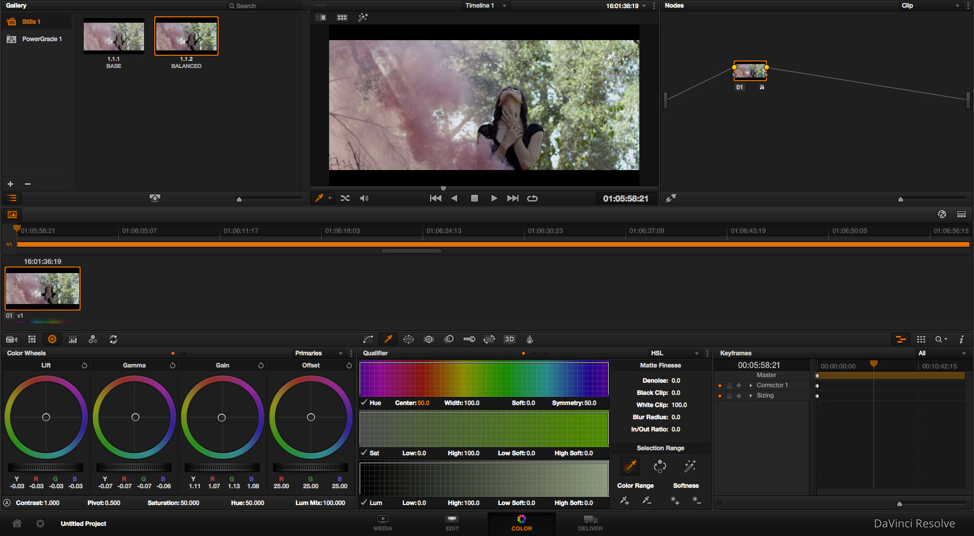
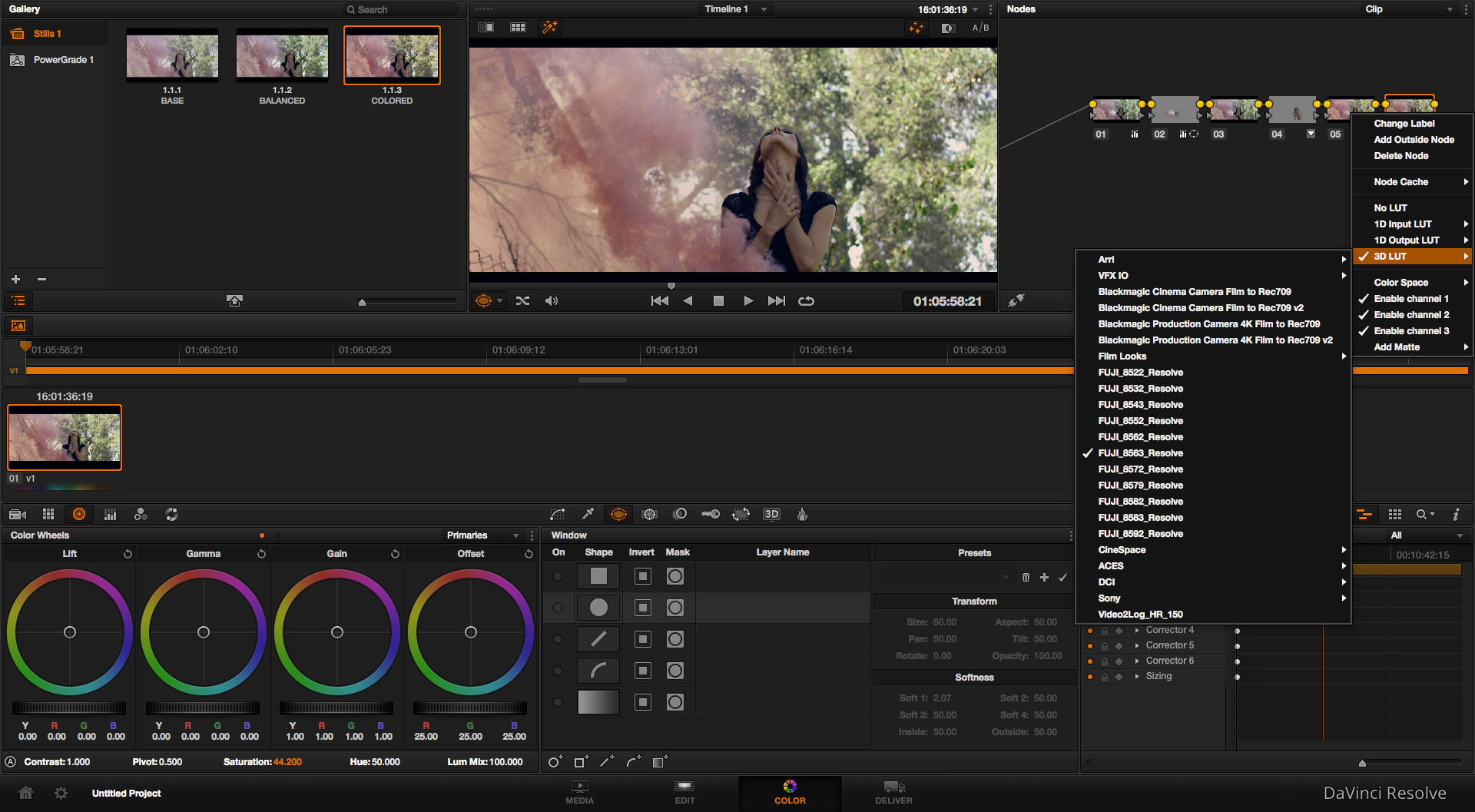
For the purpose of this article, I am going to include a few frame grabs from DaVinci Resolve, as it’s the color software I prefer to work in (and arguably the best color grading software in existence today), but these general principles can be applied no matter what software you are using. It’s all about the order in which you perform these adjustments, not necessarily which software you are using to make them.
1. NEUTRALIZING & MATCHING
Before you start coloring your footage, you need to balance your shots to fix any glaring issues with regards to white balance, exposure, contrast or any other technical parameter. The idea is that you want to work from a blank canvas once you actually start doing the creative work, and if you’re working with an image that is completely unbalanced, you are going to have a much harder time achieving the grade that you’re after… Not to mention, you’ll have an even harder time matching shots to each other in the sequence, as you won’t be able to simply apply a look that you have created for one shot to other shots in the scene.
There are two key things to remember here: 1) Do not give your image any unique style or look at this point, just give it a nice neutral baseline. And 2) Make sure to color correct every shot in the scene or sequence you’re working on to match each other before moving on. It will take you a few more minutes up front, but you’ll save loads of time later… Especially if you decide to change the look, as then you can easily blanket apply your changes to everything without having to make individual changes to every shot. When matching shots, I usually recommend picking a wide or medium wide shot as your baseline ‘hero shot’ and then matching the other shots in that environment to it.
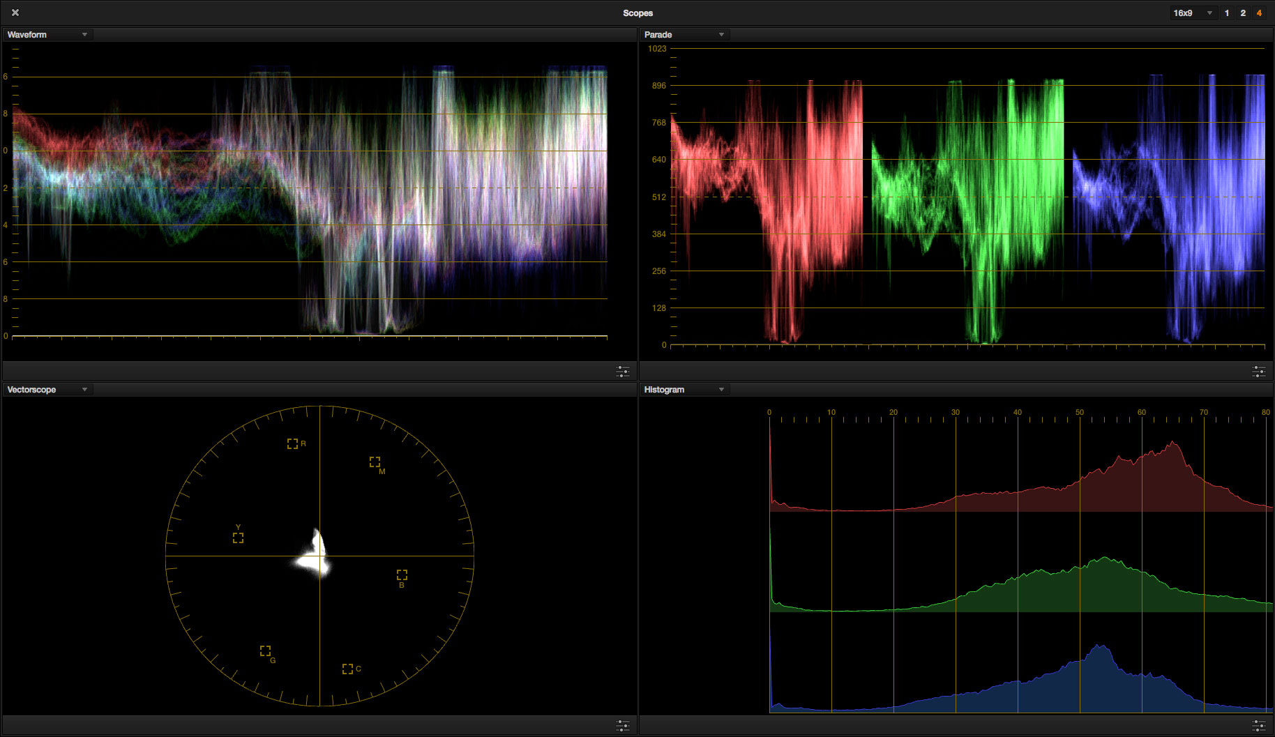
If you don’t already know how to read scopes, I would suggest that you take some time to acclimatize yourself to them. Scopes can be immensely helpful in showing you a visual representation of where your image sits – in terms of saturation, color balance, contrast, and more.
2. EXPOSURE FIXES
If you did your job well in step 1, your image should be generally well exposed. That said, in many cases even if your starting image is relatively well balanced, there are bound to be some small exposure issues that you may need to solve as part of step two. For instance, maybe there is a window that is blowing out in the background, or someone’s dark t-shirt is clipping to black. Whatever the case may be, it’s best that you adjust these issues at this stage in the process – not before or after. In the case of the blown out window – imagine you attempted to compensate for this in step 1. You would end up with a window that is properly exposed, but an overall image that is underexposed. The same goes for attempting to lift shadows to compensate for an area that is too dark, and then ending up with an image that is washed out.
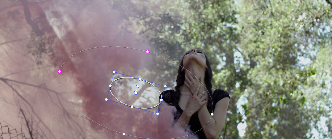
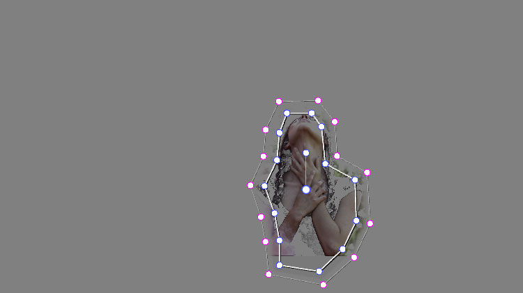
In terms of specific ways to fix these issues, there are many different techniques that you can use, but probably the most effective way is by using power windows. A power window allows you to isolate a specific area of your image and adjust anything that you’d like within it’s boundaries.
I’ll point out again that it’s important to remember not to start creating your look at this point – you are simply setting up the image for the grade.
3. COLOR FIXES
Much like the previous point, this stage is all about fixing issues that couldn’t be fixed in your primary grade (step 1), but that you want to fix before applying any sort of look to the shot. You might have a shot where the talent is wearing a red t-shirt, and that color is popping out far more than it should be… Which by the way is quite common. You should always be aware of vibrant colors when color grading digital footage, as they can often be far more oversaturated than they should be in the source footage.
Another big thing to look out for at this stage are skin tones. Since skin tones can often have red or pink hues to them, it’s quite common to need to reduce saturation and cool off the midtones and highlights in the skin tones to compensate. In other cases, you might have skin tones that are too green – possibly as a result of fluorescent bulbs – and need to push some purple into them… Whatever the issue may be, the solution is going to require that you use a qualifier (in DaVinci Resolve terms), or a selective color tool.
The idea is that you will pull a key on the color within the image that you want to correct, and then just affect that area. In some cases, you might also want to use a power window in conjunction with the color key in order to prevent the key from affecting other areas of the shot.
4. THE LOOK
At this point, your shot should be well balanced, and have any obvious exposure or color issues fixed. Now you are really working from a blank canvas, and any adjustments that you make to your image from here on out will be far more satisfying. Imagine for instance, you were going to apply ‘The Blockbuster Look’ to your footage, which mainly involves cooling off the shadows and warming up the highlights and mids. If you are working from a perfectly balanced image, this look would be easy to achieve. However, if you have any problem areas in the image (let’s say the skin tones are too red, and you haven’t fixed them), then this look will exacerbate the problem. Rather than the skin tones getting shifted to a nice warm color, the red in them will be pushed even further and the talent will look distractingly bad.
In many ways, this stage in the color process is the most fun as you can get really creative. In some cases you might want to hyper-stylize your footage and go for a really unique color palette, while in other instances you might stay with a natural look and simply bring out what is already there. Whatever the look you are going for may be, you will get there way faster now that you’ve done the leg work to prep your footage accordingly. And you will really notice the speed increase when you get to other shots in your sequence, which (assuming they are properly matched and balanced) can generally have the same look applied to them as a blanket effect.
5. FINAL TWEAKS & LUTS
When you’re happy with the overall look of your shot, you have the option of making some final color adjustments to help pull everything together. You usually want any adjustments that you do at this stage to be relevant to just about any other shot in your project, as the purpose of this stage is largely to create a subtle feel – or creative motif – that ties everything together. So for example, if you are going for a ‘milky black’ look, you might choose to lift up the shadows at this stage (although you could also justify doing that in stage 4).
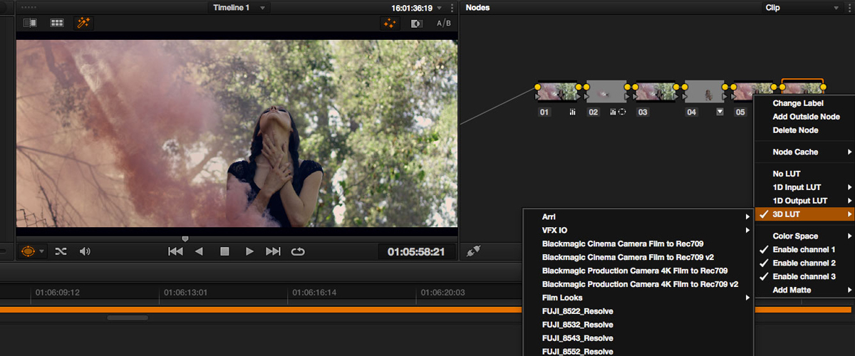
Additionally,I highly recommend adding a Creative LUT (Look Up Table) at this stage, which can really help to blend all of your color changes together, while also enhancing your overall aesthetic.
The great thing about setting up your LUTs/your overall final look on it’s own node (in Resolve), is that the final node can easily be tacked on to other shots in the project and still work really well. For example, you might be coloring another scene later on that has a totally different look to it, but you can still apply the color adjustments from that final node (on your first shot) to the end of the node tree on the next scene too. Since this node is primarily dedicated to making overarching (and relatively small) stylistic changes, it can be used on scenes that have very different grades, and will help the entire project to have more consistency. The same principle applies even if you aren’t use a node-based color system, but it’s especially easy when using software like Resolve.
FINAL THOUGHTS
Like most aspects of filmmaking, color correction is both a creative and technical process – but not necessarily in that order. To achieve the best results creatively, you want to get the technical adjustments out of the way first. This will take a few more minutes up front, but could potentially save you hours of time later on, particularly if you decide to change your creative look at any point. Also, it’s really important to note that just because I’ve listed 5 steps above, doesn’t mean that those adjustments should be made in only 5 nodes or layers. In some cases you might need more… For example in step 3, there may be more than one color that needs to be keyed, so don’t be afraid to add as many adjustments as you need until each step in the process is complete. And conversely, you may have a near perfect shot to work with that doesn’t require step 2 or 3. So always use your discretion, and when you do need to adjust all of the usual parameters, be sure to do so in this exact order.
For exclusive filmmaking articles every Sunday, sign up for my newsletter here!


41 Comments
Хронометры Rolex Submariner цены
atRolex Submariner, выпущенная в 1954 году стала первой дайверской моделью, выдерживающими глубину до 330 футов.
Модель имеет 60-минутную шкалу, Triplock-заводную головку, обеспечивающие безопасность даже в экстремальных условиях.
Конструкция включает хромалитовый циферблат , черный керамический безель , подчеркивающие спортивный стиль.
rolex-submariner-shop.ru
Автоподзавод до 3 суток сочетается с перманентной работой, что делает их надежным спутником для активного образа жизни.
С момента запуска Submariner стал эталоном дайверских часов , оцениваемым как коллекционеры .
5 Essential Settings For The Perfect Color Grade - Noam Kroll
at[…] as it’s important to always follow the correct order of operations when color grading, it’s as essential to follow the right technical protocol before mastering […]
How to streamline your post-production workflow
at[…] most video engineers have their own workflow, so this step will probably vary. But most of them start by adjusting the black tones in the image, […]
Tutorial: How To Create a VHS Look In Post + Free VHS Texture Download
at[…] you’re following a standard order of operations, you would color correct your footage before applying the texture. At a minimum, all the shots […]
Here Are Ways to Streamline Your Post-Production Workflow | Filestage
at[…] most video engineers have their own workflow, so this step will probably vary. But most of them start by adjusting the black tones in the image, […]
How To Apply Color Grading LUTs Professionally + My Workflow Explained – ideafolders.com
at[…] far as workflow is concerned, I’ll always start by following the correct order of operations, and balancing/neutralizing my shots before doing any other color work. Once complete, I’ll […]
Kent
atFirstly, thanks very much for sharing your knowledge with us. I hope you have the time to comment on my question.
Noam Kroll, “I have also worked extensively with Sony S Log3 footage and always found the skin tones to be a big challenge.”
Noam, I shoot with an FS7 usually in slog3.cine and have tried a great many LUTs (not looks) to get a base image with appropriate contrast in the middle greys (fleshtone). I like Alister Chapman’s LUTs and the 709aa Lut which emulates an Arri look. But more times than not the fleshy bits look washed out and have little contrast compared to the same scene shot using the camera’s rec 709 setting, whether or not I dial in a hypergamma. I have tried simply using curves with no LUT to little affect.
My steps
1) import the properly exposed footage (I shoot a MacBeth chart and have even started shoting an 8-step grey chart at times). Slog3 footage exposed to 60% IRE with no monitor LUT.
2) Perform any exposure correction on the footage with the first Lumetri layer (I use Adobe Creative Suite 2018). I have been told by several people including a Sony rep to exposure correct slog footage before applying my LUT.
3) Second Lumetri layer is where I apply the LUT (slog3 to rec 709) and adjust color balance (shooting with this camera under mixed lighting can really make the fleshtones sickly looking, I only have three preset white balances in slog mode and no in-camera +green/-green.). I have also tried WB in the first layer before the LUT. It looks better some times.
4) Third layer through … Lumetri layer(s) is where I apply what is called secondary color correction in Lumetri (I think Resolve calls is power windows) to address specific areas that need color adjustments (blond wooden floor is too greenish, overhead LED lighting I can’t turn off projects a magenta/purple cast on the walls, etc.)
5) Last layer is a LOOK if I need it.
What am I doing wrong, that many times I feel my fleshtones are washed out. With footage of people who have wrinkles in real life it looks like I have purposefully applied a high gamma adjustment to the fleshtones and middle greys.
Do you see the same issue with FS7 slog3 footage? I have two buddies who are experiencing the same thing. Any help you can offer will be greatly appreciated.
Kent
Noam Kroll
atGreat question, Kent. It’s hard to say for certain without seeing your footage (feel free to e-mail me samples at info@noamkroll.com), but generally it does seem like you are following the right protocol. Please feel free to shoot me an e-mail and I will respond in more detail once I can see it for myself!
Shreyash
atHi. is the same LUT used for every scene in the film ?
Say for example, you wanna give your film a grungy look and you add a bit of reds in the shadows, that would make sense for a dark indoor shot, but for an outdoor shot do we need to work on the same lines or adopt for a different process altogether?
Noam Kroll
atIt really depends on how well the footage was captured in camera. In most cases, I use a few different LUTs throughout various scenes. But on some projects (where exposure and color balance was nailed in camera) one LUT can work across everything. Hope this helps!
WEEK 15 | DAY 2 – CMDP2600: Creative Media Making
at[…] http://noamkroll.com/the-best-order-of-operations-for-color-grading-why-it-makes-all-the-difference/ […]
Colour Grading – Music Video | Post-Production
at[…] http://noamkroll.com/the-best-order-of-operations-for-color-grading-why-it-makes-all-the-difference/ […]
Color Correction – Sarah Collins
at[…] http://noamkroll.com/the-best-order-of-operations-for-color-grading-why-it-makes-all-the-difference/ […]
Ibrahim
atHi Noam,
I have a few questions when it comes to color grading cinematic shots for shortfilms and movies in davinci.
I use davinci to color grade my 5d mark III footage (in Magic Lantern RAW cinemaDNG).
Before I come to my questions let me know if there is anything off with my following color grading setup for night shot under yellowish outdoor lights on the streets. The aim is to color grade a movie:
At first I convert my cDNG to ARRI log space.
1- Temporal NR (luma 10, chroma 10 for night shot)
2- Spatial NR (using the splitter Red, green and blue channel separately. luma 2, chroma 10)
3- Sharpen (using MD – midtone detail) * Usually set around 40-60
Q1: I come from the After effects (adobe camera raw) world and wonder if there is a way to only apply sharpen to the edges of the shot just like the samurai plugin or the ACR does.
4- Film grain using mixer layer (and the grain scan as a matte). I use the well-known 4k 35mm fine grain scans from rocketstock. I set its opacity to 40-50%. Softlight for nightshots while overlay for dayshots. Saturation always set at zero.
Q2: Do I need to think about its contrast?
Q3: Is davincis own film grain plugin better than rocketstock’s?
5- Parallel node of three branches:
First: fist node white balance then second node contrast
Q4: I wonder if I should do white balance prior to the applied LUT while having the LUT node on or off?
Second (beneath): Saturation adjustment (lum vs sat, shrink down the shadows and highlights. Then adjust in the curve in the midtones of the lum vs sat)
Third: Film look (adjust the blues and green in the lift and highlights). The aim is not to move away from the LUT other than decrease the green and increase the bluwishness in the shadows.
6- Apply LUT usually blackmagic film v2 or osiris M31. I seek the orange teal look for crime and drama movies.
Q5: Do you know of any such LUTs better than these?
7- Light vignetting on the 2.35:1 aspect ratio
Q6: I wonder if I should do white balance prior to the applied LUT while having the LUT node on or off?
Q7: Is there something destructive in the node system, especially when it comes to the parallel node part? That is to say if white balance, contrast, Saturation and film look is done at its best place.
Q8: In rec709 do I work from 0-1023 in the waveform, because some say that I should be working from 64 to 940?
Q9: In adobe premiere and after effects the luma of the skin tones (on the waveform) should be around 65, at what value should it be in davinci that doesn’t use the same value system?
Q10: One last question. Is there a way to apply the teal orange look on a footage keeping the skin tones intact I don’t have the plugin false color to work with.
Sorry for asking so many questions. I have been working around the clock to learn davinci which I’ve been in love with. 😀
I just need a bit of help in these areas from your expertise.
Many thanks in advance Noam.
Kevin
atVery helpful as I’m new to color correction and like in math, I want to get my order of operations correct. With regard to the order of operations above:
1) Neutralizing and matching
2) Exposure fixes
3) Color fixes
4) The look
5) Final tweaks and LUTS
I notice in the comments, you say that the LUT should always be applied first, but in Neutralizing and Matching I didn’t see any mention of a LUT in that step and see that a creative LUT is applied in Step 5.
Are you saying that a non-creative LUT should be applied before or in Step 1, before any exposure or white balance tweaks are made in Step 1? Is there any time when you would do an exposure or white balance correction before applying the n-c LUT?
Do you see any value in the terminology of Primary versus Secondary Color Correction?
Thank you very much.
Noam Kroll
atHi Kevin,
Great question and I am happy to clarify. You are correct in that I meant to say any technical/translation LUT (such as log to Rec 709) should be used before the first step… Although many filmmakers (including myself) often skip this step, and simply add contrast/saturation manually in step 1… It’s really a matter of personal preference. Step 5 is where you would apply a creative LUT.
As for the terminology, I don’t usually discuss things in primary/secondary terms – Mainly because on a complex grade everything other than the first correction is essentially a secondary, so it can be a bit vague in conversation. I think that terminology makes a lot of sense when you are doing a very basic pass. Maybe one node to balance and one to fix any additional tweaks…
That said, many people use the terms and they are very much industry standard, I just don’t happen to have them in my own lingo that often!
Final stages of ‘MUSICORUM’ | Eddy's world
at[…] Order Of Operations For Color Grading & Why It Makes All The Difference. [online] Available at: http://noamkroll.com/the-best-order-of-operations-for-color-grading-why-it-makes-all-the-difference/ [Accessed 31 May […]
Maximillian Anderson
atDear Noam,
I love your blog. Been reading it for over a year now. Thanks for all the effort you put into it.
My question is about grading my DSLR footage. I have the Nikon D3300, maybe like the little brother to the 5300 you’ve recommended in posts past. Unfortunately, when I try a simple grade with my footage in DaVinci, it looks terrible. Even a simple grade like pushing shadows to blue and pushing mids and highlights to orange makes it look bad. There’s no flat profile for the D3300. I’ve experimented with shooting with the neutral profile, but grading still makes it look bad. Any ideas about what I’m doing wrong? I’ll keep experimenting with it.
Thanks again for your great blog Noam.
Catch you later!
Noam Kroll
atHey Max! It’s hard to say what the issue is without seeing the footage. Would you mind e-mailing me a screenshot to info@noamkroll.com ? I should be able to give you some better advice that way!
richard
athi Noam,i have this issue,i shoot using panasonic Gh4,i grade using davinci,the problem that i experienced is that after grading in davinci and am satisfied,when i export the file,then i compare the the graded picture inside davinci and the exported,the exported file looks slightly washed and the shadows are washed and the grade is not rich as i had graded.please guide me so that i get the export grade look rich.
Noam Kroll
atHi Richard! It sounds like you may be monitoring using the wrong gamma settings inside of DaVinci Resolve. Try going into your settings panel and adjusting the gamma level to find the setting that matches your output.
Basically what is happening is Resolve is displaying your footage with more contrast than is actually there (based on your monitor settings). Then when you go to output it, you are viewing an image that looks different to your eye when it is outside of Resolve. Make sense?
Caroli
atHi Noam. Great article! Thanks a lot for sharing your knowledege.
I have a question: in this order of operations, where should I do secondary color correction such as digital relighting (faking lights that come in the frame, creating shadows, etc)?
Noam Kroll
atHi Caroli – thanks for the note! I would recommend doing any of the digital re-lighting during the 3rd step on this list. Hope this helps!
Aaron Jacobs
atHey Noam,
Your website is a gold mine of information – appreciate you writing these posts and sharing your experience, really invaluable. Anyways, you directed me here from the ‘GH4 video settings’ post based on a grading question I had. After reading through the post as well as comments/responses, this was my take away:
– Very first step of editing a project should be all of the timeline work (cropping, sizing, sequence, transitions, etc.,) all of which you recommend doing with a software like premiere.
– There;s no need to pre-grade in premiere as Resolve can handle everything for color.
– Once you’ve completed all of the timeline and structural editing, import the project into DaVinci to color grade and complete the project.
Over simplification, but are there any major aspects in-between that I’m overlooking?
Noam Kroll
atThanks Aaron! And your summation is absolutely right… That’s typically the workflow that you want to use, although it’s definitely worth running a quick workflow test before cutting a full project. For instance, you can (and usually should) start cropping, re-sizing etc. in your editing software, but you might want to make sure those changes are imported into DaVinci properly via XML. They should be… But you never know if there could be a bug, translation issue, etc. between Resolve and whatever version of Premiere you may be using, so I always recommend running some workflow tests just to be safe!
Week 7 – Visual – Marwan Boudanga – Film & TV
at[…] http://noamkroll.com/the-best-order-of-operations-for-color-grading-why-it-makes-all-the-difference/ […]
The Best Order Of Operations For Color Grading & Why It Makes All The Difference – AIS Post Blog
at[…] With color grading software like DaVinci Resolve and Adobe Speedgrade being readily available to just about anyone with access to the internet, it’s no surprise that more and more filmmakers are attempting to color their own footage. In many cases, I would advise against coloring your own work unless like myself, you also work as a dedicated colorist. That said, if you are set on color grading your own projects, or are simply a colorist starting out, one of the most important things you need to tackle is the order of operations with which you approach your color process… Read Article. […]
Alexander
atHey Noam
How do you go about bringing your project into DaVinci? Say you do your edit in Premiere and are happy with it. What then? Export it in lossless format? How do you go about transitions? Maybe advanced effects applied to some of the clips? When that applies I’ve always just done my grading within Premiere itself as I don’t see how I would go about doing it workflow wise with DaVinci..?
Noam Kroll
atHey Alexander! The standard protocol is to remove all effects from your timeline before sending it to DaVinci. You can leave basic settings adjustments (cropping, re-sizing, etc.), and basic transitions (such as cross dissolves), as DaVinci Resolve will be able to support those as well.
Typically you want to export an XML file from Premiere and import it into DaVinci Resolve, along with all of your footage. Once it’s colored, you can output it/send it back to Premiere and add on any additional effects as needed. Alternatively, you could render out the effects shots as self contained files and color those individually in your DaVinci session. Hope this helps!
Joel
atHello, I am trying to get a workflow down but not sure the way to do it for color. I edit in RAW and make a proxy for the files until edit is nearly complete. Then, I turn off the proxy and do a basic color grade in premiere (Should I do a basic color correction/grade?), then I tried exporting my timeline to resolve but it didn’t work well at all, so I exported as cineForm 16bit file to resolve, finished coloring, export Cineform 16bit back to Priemere to export different copy’s in Encoder. I feel I’m going about this wrong? (Also, what kind of formats do you keep footage in for archival?)
Noam Kroll
atHey Joel! I would recommend doing all of your color in Resolve – there is no need to pre-color anything in Premiere. With regards to workflow – you should be able to simply export an XML file from premiere, and open that up in Resolve. Doing that will allow Resolve to bring in all of your RAW files and you won’t need to export a RAW master file. Make sense?
With regards to archiving, I typically use ProRes 422(HQ).
Lana
atHey Noam,
Really nice article! I wanted to ask you, what’s your workflow between the editing software and DaVinci? I’m starting to use DaVinci now and I can’t get my head around it really.. How can you apply the look created in DaVinci to a project edited in Premier for example?
Appreciate your help a lot!
Thanks for everything!
Noam Kroll
atHey Lana! You can send projects to DaVinci Resolve using an XML file. Once your project is edited in Premiere, you simply export an XML file and then import that file into DaVinci Resolve (there are some tutorials out there that show you how to do it – but it’s quite easy). DaVinci Resolve will then automatically import all of the files from your Premiere Pro timeline into Resolve and will re-build the edit for you.
The Best Order Of Operations For Color Grading & Why It Makes All The Difference | Noam Kroll | mycolorgradingtricks
at[…] Source: The Best Order Of Operations For Color Grading & Why It Makes All The Difference | Noam Kroll […]
Bidemi Ajibodu
atThank u so much for sharing such a wonderful information on color grading with us.
I am blessed with this,my mentality and approach to color grading has changed because of your input in my media life,
Pls continue ur good work,pls keep me updated in all ur article.
May the Lord bless you,
Bidemi Ajibodu from Nigeria
Noam Kroll
atThanks a lot! Appreciate the kind words.
Joseph
atJust wanted to say that I truly appreciate this article and it has helped me considerably.
I am currently shooting a short film ENTIRELY on a GoPro Hero 3+ Black Edition consumer camera with absolutely NO budget. I know, I know, that sounds crazy, but my idea was to prove that while it IS good to have more expensive equipment at your disposal, all it REALLY takes to make something with wonderful production value is time, effort and tenacity and not necessarily the former. Having said that, I do have a couple of higher-end camera models with better lenses and better all-around capabilities of capturing that “look,” but again, I’m going for the “do something BIG with something little” effort this time around as a way to not only prove to myself that it can be done, but to others who may wish to tell a cinematic story as well.
I would consider myself a decent cinematographer but I am still learning something new every single day with color correction and grading. My rule of thumb as far as post-production color work is that there is no real “right” way to do things, as everyone has different tastes, but this article lays out a workflow that is both practical and concise and I have incorporated it into much of my post-production workflow. I am getting GREAT results with SO little.
Thank you very much.
Jonny 5
atThanks for the write up Noam! I have been looking for a guide like this for a while. I am shooting on a sony FS7 and mostly shooting in Log format. Really starting to enjoy the coloring aspect of the process.
One question I have for you, because I have read a few that changed the order on this is the LUT placement in the sequence, by the sounds of it since I’m grading LOG footage I should be starting my edit with a LUT at the first node. Or am I better off to balance everything and do it at the end. Also I’m having a hell of a time with skin tones because A. I’m in Canada and everyone is pale as hell. B. the Sony just doesn’t seem to love them. I have made it a little easier by always lighting my talent with a warm light and lighting the background cold as it separates them a little, But when ever I try to get a stylized look out of it, it seems to get a little to noticeable.
Noam Kroll
atAny time Jonny, and thanks for the kind words! To answer your question – you should always add your LUT first. I wouldn’t suggest pre-coloring your footage before adding a LUT as you might wind up with some inconsistent results and it will likely take you much longer to reach the look you’re after.
As far as your challenges with skin tones, I totally hear you. I’m originally from Canada too (Toronto), so I completely get the pale skin issue – haha. I have also worked extensively with Sony S Log3 footage and always found the skin tones to be a big challenge. I would suggest experimenting with different types of sources (kino vs. tungsten vs. hmi, etc.) to see what works best for you. Sometimes the best results will simply come from getting the lighting right on set, and ensuring you are using the ideal type of sources for your camera. Good luck!
The Best Order Of Operations For Color Grading & Why It Makes All The Difference | Noam Kroll | myeditingtricks
at[…] Source: The Best Order Of Operations For Color Grading & Why It Makes All The Difference | Noam Kroll […]
Auto Balance, ¿cómo encontrar un punto neutro? |
at[…] el color de una imagen, el orden de los procesos sí altera el producto. Siempre es recomendable empezar por neutralizar y emparejar todos los planos de una secuencia antes de darle algún look […]
Veydra MFT Cinema Lens Kit Review & Rokinon Cine Lens Comparison | Noam Kroll
at[…] Normally the first step that I will take when coloring a project is to match every shot before any c… That step will be virtually eliminated in my color process this time around as the shots already match perfectly as a result of the consistency of the Veydras. […]
How To Match Skintones Perfectly Using Qualifiers & Power Windows In DaVinci Resolve | Noam Kroll
at[…] than following the correct order of operations (as outlined in this blog post), they will jump straight into giving their footage a creative look and then will have major issues […]
Adobe SpeedGrade CC 2014 v8.2.0 Multilingual (Mac OSX)
at[…] SpeedGrade CC 2014 v8.2.0 Multilingual MacOSX | 664 MB SpeedGrade is a color grading application providing layer-based color correction and look design tools to ensure that digital […]
How To Use Layer Nodes In DaVinci Resolve For An Easy Bleach Bypass Look | Noam Kroll
at[…] For more on color grading, check out my recent post on the best order of operations for color correction here. […]
DaVinci Resolve Grading Round Up | Jonny Elwyn - Film Editor
at[…] Noam Kroll has an in-depth explanation on the importance of the order of operations when colour grading, and the difference they can make to your work. […]
Dave Pultz
atIn large post houses the Junior Colorist will do a “pre-grade” as the first step before the Senior Colorist starts work.
Noam Kroll
atGreat point, Dave. Thanks!
This Week’s “Things” – Week of 1/19/2015 | My DoP Things
at[…] for Color Grading & Color CorrectingThings Type: Color Grading and Color CorrectingLink: http://noamkroll.com/the-best-order-of-operations-for-color-grading-why-it-makes-all-the-difference/Notes: Noam Kroll discusses the best order of operations for color grading. HH’s take – […]
Simone
atDear Noam,
thank you very much for this great article! Your website is a goldmine of knowledges!
I use FCPX, but I’m also interested in DaVinci, since the lite version is free on AppStore and your article is pushing me to try it!
I’ve bought your amazing “Cinematic Guide”: do you have some special tips for color grading GH4 footage in order to achieve the most common looks (natural, blockbuster, milky black)?
Thank you very much,
Simo 🙂
Claudio
atCiao Simo volevo chiederti qualche dritta sulla gh4 e fcpx mi puoi lasciare un tuo contatto? Ti ringrazio.. Claudio
Simone
atCiao Claudio! Eccolo: info@simonesalvatore.net 🙂
Simone
atEccolo: info at simonesalvatore . net
Noam Kroll
atSo glad you’re enjoying the guide! As far as the GH4 goes, it really depends on which picture profile you are shooting with. The key is to grade your image to a neutral starting point, and then to give it a ‘look’. So for example in cine D, you might first want to add in the contrast, fix any white balance issues, etc. and then go ahead and push the levels around to get the style you want. By doing that, you can take the same approach for 90% of your color process no matter what camera you are using, the only thing that changes is the first step (which involves balancing and neutralizing your image based on the settings you chose in camera). Hope this helps…
Simone
atThank you very much Noam! 🙂
I love the GH4 quality, but sometimes, especially in mixed light conditions I have some weird skin tones – nothing I can’t fix in post, but I always prefer to have a nice skin tone in the beginning.
Other then that I find that the skin color is often a little below the skin tone line: do you know how to correct it in camera?
Noam Kroll
atI couldn’t agree more. I find that the GH4 sometimes flattens skin tones and gives them a bit of an orange hue. This is especially the case in Cine-D mode, which I don’t always use for that exact reason. I would experiment with shooting in Cine-V, or customize your white balance offset to push just a touch more magenta into the image.
Simone
atThank you very much Noam! 🙂
The Best Order of Operations for Color Grading and Why it Makes All the Difference | FilmmakerIQ.com
at[…] With color grading software like DaVinci Resolve and Adobe Speedgrade being readily available to jus… […]
Alex
atIf one was applying Sharpening and Noise Reduction, is there a recommended order for them?
Noam Kroll
atI would reduce noise first, and then sharpen. Good luck!
George
atThanks Noam!
About NR and sharpening,in which step do you recommend adding them?
NR in 1st step and 6th step (after final tweaks and lut’s ) for sharpening?
Noam Kroll
atNo problem, George! In terms of NR –
It often depends on the quality of the source footage and how much am I going to need to grade it. That said, I will often do noise reduction as a first step, and then apply a grade. Rather than adding sharpness, I’ll instead add film grain which will typically simulate sharpness in the image and simultaneously will mask the artifacts from the noise reduction. Hope this helps…