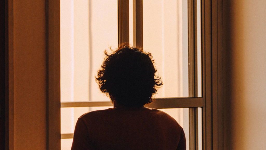
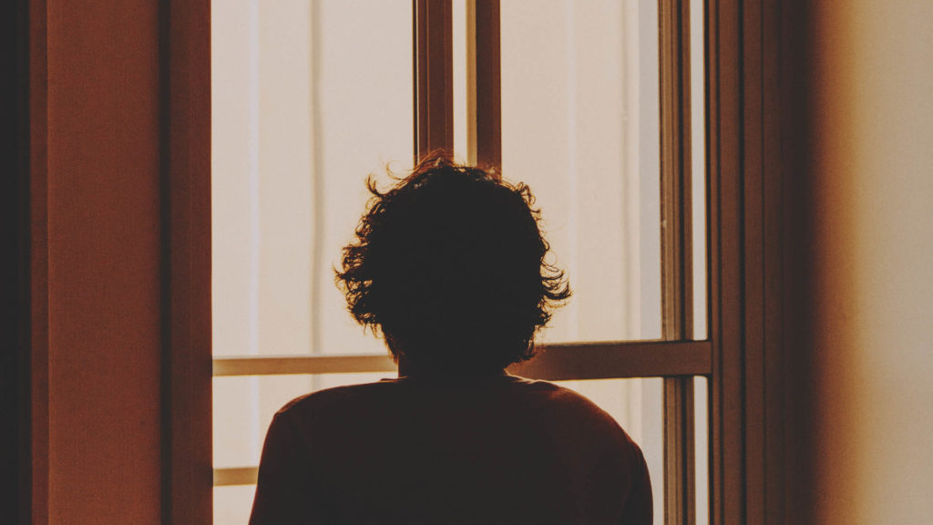
I’ve written a lot about creative color grading here on the blog, but today I want to cover the most essential technical settings you should consider before mastering any completed project.
It’s easy to become hyper-focused on the creative aspects of grading, and lose sight of the technical side. But to create the best final product, you really do need to pay equal attention to both.
You may have created 5 beautiful color grades on 5 different shots in your timeline, each of which may look great on their own. But without the right technical considerations, those shots will not match or feel cohesive when strung together.
Similarly, if you don’t use the optimal export settings when mastering your colored file, the final product may look very different than you had intended.
Just as it’s important to always follow the correct order of operations when color grading, it’s as essential to follow the right technical protocol before mastering your final video.
With that in mind, here are 5 of the most important color grading settings to guide your workflow:
Camera Raw Settings & Input LUTs
Your first step in the color pipeline is ingesting raw footage into your color software. This is straightforward – but once the footage is loaded in, you have to prep it before getting to the creative grade.
The exact workflow for this is dependent on your acquisition format. And in some cases, no prep work will be needed at all.
For instance, if your footage was shot in a standard Rec 709 color space (as opposed to Log), you can just drop it into a Rec 709 color session and get to work. No technical conversion needed.
But if you did choose to shoot in Log to preserve more latitude, you will of course need to convert the footage out of Log as a first step. This can be done manually, but it’s much faster and easier to use a color correction LUT to convert the footage for you.
If your footage was shot in a Raw format, you also need to prep it for the grade, although not necessarily using LUTs.
Below is a screenshot of DaVinci Resolve’s Camera Raw Panel, along with the settings it offers:
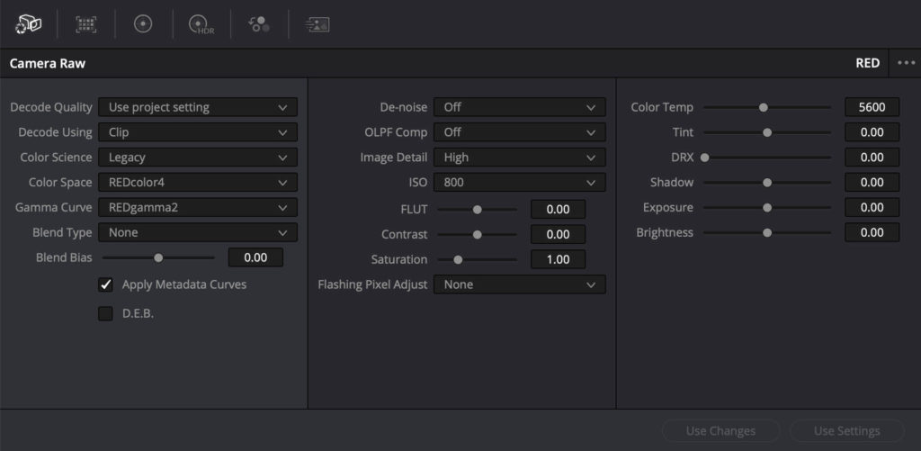
When working with Raw, you will adjust ISO, white balance, color space, and other important input settings at the beginning of your process.
Your exact settings will vary from project to project. But as a rule of thumb – set these parameters up front and keep them consistent. Changing them mid-grade will mean you have to re-work every shot that’s already been colored.
Color Balance
Color balance is often thought of as a subjective measure, but it can be technically quantified too. To ensure your final product looks as polished and uniform as possible, it’s crucial to find a neutral/balanced starting point with each image.
Even if you intend to create a highly stylized color palette that is intentionally unbalanced (like a sepia look), the grading process always has to start from a neutral place. It helps you get a better final look, and work toward consistency across your project.
So how exactly do you technically correct for color balance?
The most obvious place to start is with your white balance. Most editing platforms now have an eyedropper tool that allows you to auto correct the white balance.
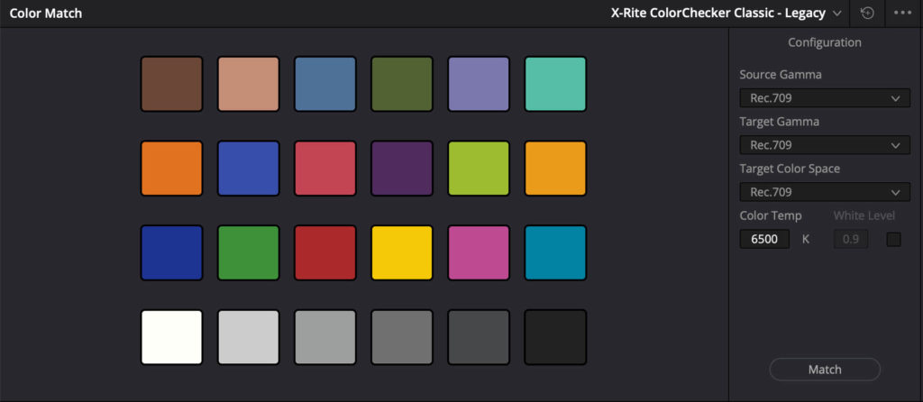
DaVinci Resolve goes further with their color match tool, which works really well. You just have to ensure you shoot a color chart (X-Rite Color Checker, etc.) on set before each setup:
You can also manually adjust your warm/cool and tint settings to find neutral white points. This is typically what I recommend for the most consistent results.
Remember though, dialing in your white balance is just part of the equation.
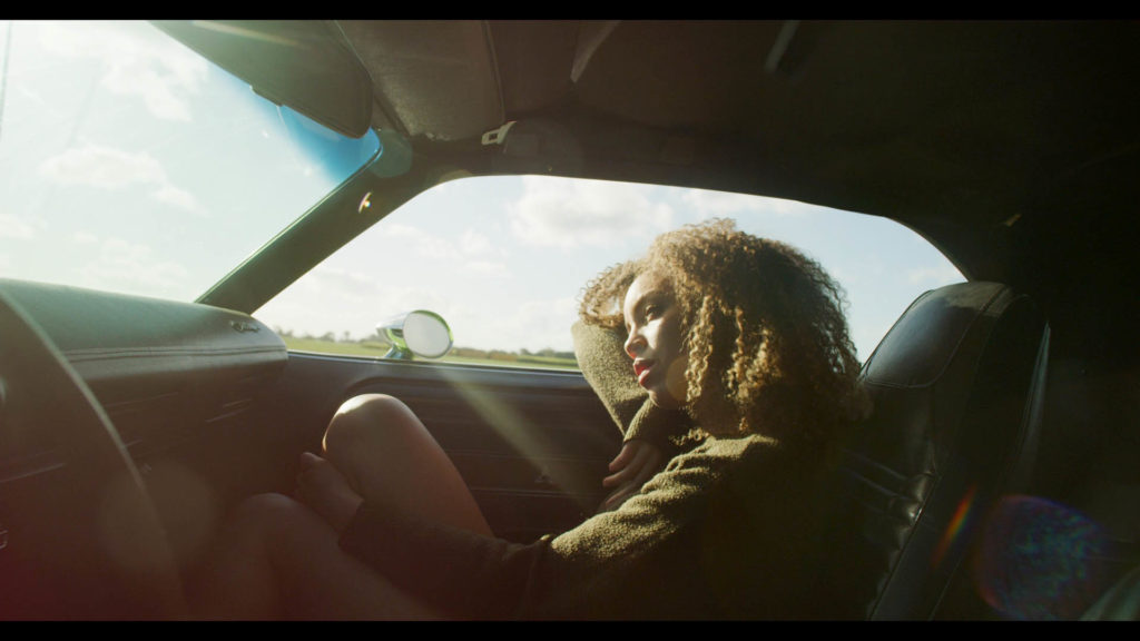
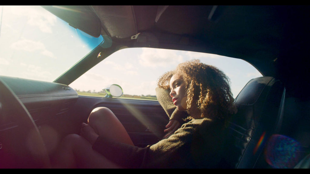
Imagine you are coloring a shot captured in a red room with neon lighting. You’ll be left with a color cast that washes out the image, even with a white balance adjustment.
To solve this, you can create more color separation by pushing shadows and highlights in opposing directions. This can be measured subjectively by eye, or technically using your scopes.
No matter which method you choose, the goal is always to find the most naturally balanced starting point.
Be sure to complete this step before you do any creative grading.
Shadow / Highlight Clipping
It’s just as important to maintain consistency in contrast as it is with color balance. Doing so calls for special attention to be paid to your shadow and highlight settings.
Keep in mind though, there is no universal contrast setting you can apply to all of your shots evenly.
Imagine dialing up contrast to 125% across the board. It will look good on some shots, but poor on others. It all depends how the footage was exposed.
Some filmmakers get frustrated when they attempt to copy and paste contrast settings throughout their entire project, finding that their shots don’t match. But there is a solution for this.
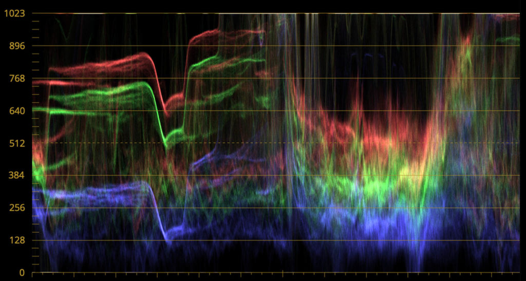
Use your waveforms to dial in consistent shadow and highlight levels.
For the most natural look, you’ll usually want your darkest shadows to sit just above 0, and your brightest highlights under 1023.
You can veer off from this for stylistic purposes if you’d like. For instance by setting your black levels to 128 to create a milky look. Or by bringing your highlights way down for a retro vibe.
Whatever the choice though, be sure to maintain it from shot to shot.
Don’t forget to also unify shadow/highlight clipping between shots. Software like DaVinci Resolve has special tools for this, but you can do it with a simple curves adjustment in any NLE.
Whether you clip your shadows/highlights is up to you. But again, whatever choice you make – it should be applied globally to the entire project.
Saturation Curve
Much like contrast, there is no one saturation level that will work well on every shot. Taking down your saturation by 10% might work wonders on one shot, but make another look lifeless.
Some shots naturally have more saturation in them, because they were captured with full spectrum natural light or feature bright wardrobe. Others have less saturation as a result of narrower light sources or less vivid production design.
While grading, move through your project shot by shot to match relative saturation levels. Quickly dial up or down saturation on each shot (using a reference frame), and you’ll soon be most of the way there.
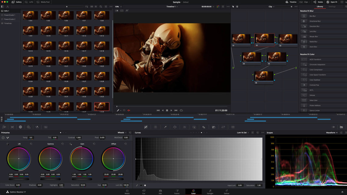
As an additional step however, I recommend adding a Lum Vs Sat curve at the end of your workflow.
Here’s an example of one in DaVinci Resolve:
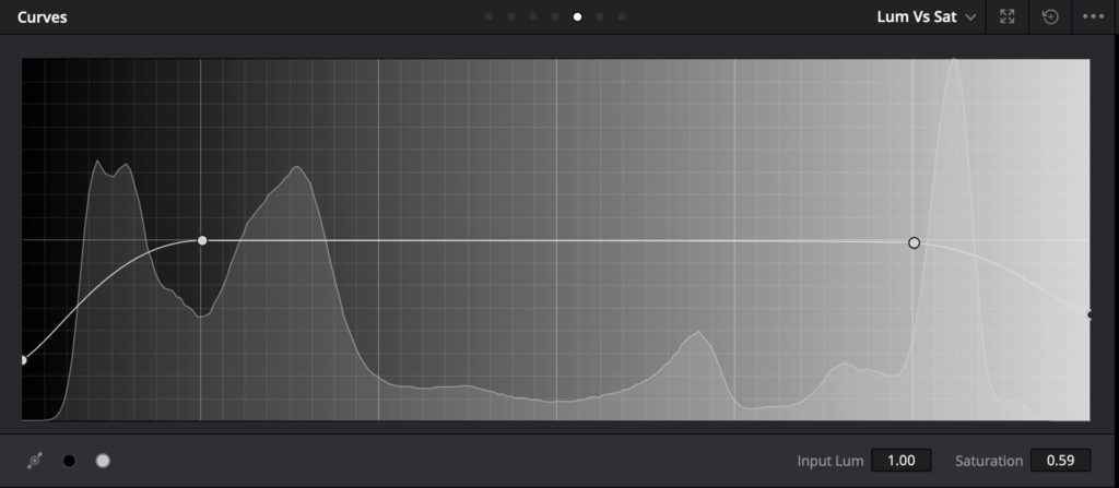
In the above, I have rolled off shadow and highlight saturation, while maintaining regular levels elsewhere.
This will normalize certain inconsistencies in shadows & highlights across the whole project. The result is a timeline that feels a touch more uniform and cohesive.
There are many different types of curve patterns you can use here. The one above is just one example that worked for a specific project of mine recently
Remember: this is meant as a final step to add an extra 10% polish. It’s not a substitute for manually matching saturation levels, but it will help blend it all together at the end of the pipeline.
Export Settings
Once you’ve followed the steps above and completed your color grade, all that’s left to do is export your master file. This is a simple step, but one that can cause frustrating color shifts in the final video.
If your contrast ratio looks off after outputting the file, it was likely exported with the wrong gamma settings.
You might be previewing your shots in 2.2 gamma, and then exporting them in 2.4. This will create variance in contrast when exported.
Similarly, if you render your video as a highly compressed h.264 file, you’ll likely notice some degree of color shifting.
For best results, export at full resolution in ProRes 422 HQ – which has incredible color accuracy. ProRes 4444 is an option too, but is usually overkill as a mastering format. Depending on your technical delivery requirements, you can of course experiment with other formats as well.
Hopefully this has been helpful for those of your looking to streamline your technical color grading working.
To try my custom color grading LUTs and post-production assets, click here!
If you have any questions, leave a comment below!
For exclusive filmmaking articles every Sunday, sign up for my newsletter here!


5 Comments
Tempo Garments
atThe long neck turtle line from Tempo Garments will help you discover warmth and sophistication. Our designs are made with high-quality materials and provide classic elegance for any setting. Tempo Garments long neck turtle shirts, which come in a variety of stylish designs and traditional solids, will upgrade your look and add sophistication to your wardrobe.
Fotografer
atThank you for the sharing.. I will try in my next project..
Tom Whitus
atThank you for the information about color grading. I’m looking for someone that is affordable and good (fast not necessary, I know, pick two), to color correct my latest film. If you have any ideas, please let me know. Thanks. Tom Whitus, Silver Hills Pictures
Noam Kroll
atHi Tom! Feel free to email info@noamkroll.com and I can point you in the right direction.
Fredrik
atHello,
You Said this under the ”export setting” section. ” Similarly, if you render your video as a highly compressed h.264 file, you’ll likely notice some degree of color shifting.”
I shoot SLOG3 on my Sony a7siii. What should i do here not to render in compressed file.is it just as simple as ”dont film in that format” ?