In this quick post I am going to walk you through a very simple color grading workflow that will elevate your iPhone footage and make it appear as if it were shot on a cinema camera.
Virtually any iPhone model released in the last 4 – 5 years is capable of producing pretty incredible video results in the right hands. And as I’ve learned recently, the raw footage is very easy to grade – or even match to other cameras like the Arri Alexa.
With that said though, iPhone footage does still come off the camera with a baked-in video look. This is a result of many factors – sharpening, internal processing, small sensor size, and to a large degree color science.
It’s not that there is anything “wrong” with the native iPhone look per se, but it’s just not exclusively intended for filmmakers seeking a polished narrative or high end documentary look.
In any case, if you’re reading this article you are likely trying to break out of the stock iPhone aesthetic and find something more tasteful for your project.
There are workflows for achieving those type of results using third party apps (like the incredible Filmic Pro app). But today, I want to share a quick tip for improving your footage that was shot with the native Apple camera, which is also capable of great results.
Final Cut Pro Vs. DaVinci Resolve Vs. Premiere Pro: iPhone Footage
One quick note before we jump into the recommended iPhone color grading workflow –
Although this post focuses on settings adjustments you can make within Final Cut Pro, these exact same principles can of course be applied in any other video editing software, including DaVinci Resolve and Premiere Pro.
The most important part is understanding what the footage needs to look more organic, as opposed to which tools you use to get there.
The Color Board
For the purpose of this quick tutorial, we are going to use the Color Board panel in Final Cut Pro to make our adjustments. These same adjustments can also be made using three way color correctors, curves, or any other tool for that matter.
But perhaps the easiest way to set a base look with your iPhone footage (inside of FCP X) is to simply add a clip to your timeline, hit CMD + 6 to bring up the color board, and start making adjustments.
Exposure Settings For iPhone Footage
The very first step in your iPhone color grading workflow is to adjust the exposure levels of your shot. By default, iPhone footage seems to have a lot of overall contrast, but it’s mostly in the shadows and highlights. There is very little mid tone contrast, which is partly what makes it look like video.
The remedy for this is simple. Drop your mid tone levels way down so that you are crushing the shadows, and then bring your black levels back up to taste.
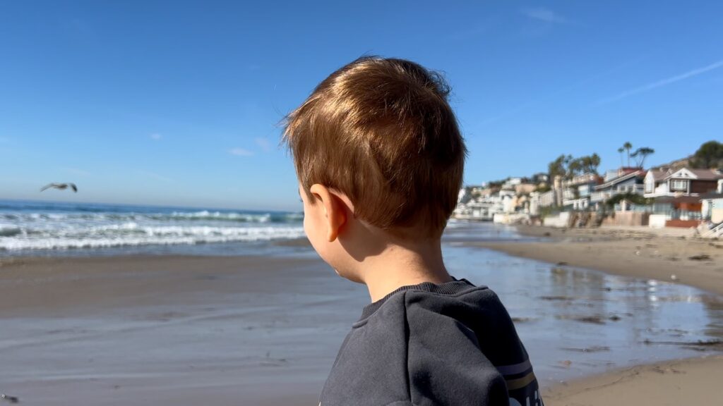
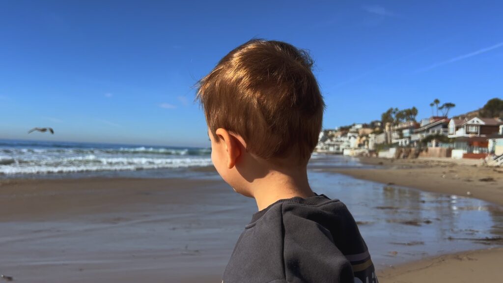
Take a look at this sample image, raw from the iPhone:
And here’s what it looks like with the mid tone / shadow adjustments:
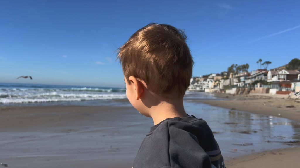
This alone improves the look of iPhone footage subtly, making it softer and more natural.
I’ve found it also helps to drop your highlight levels down a touch as well, to avoid bright highlights clipping too severely.
Every shot will be a bit different. But as a starting point, I recommend these Exposure settings:
Global: 0%
Shadows: 50%
Midtones: 80%
Highlights: 10%
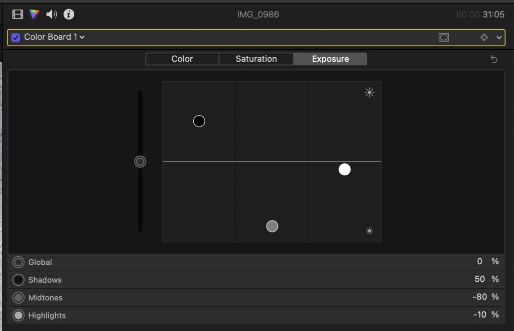
With those dialed in, you can easily adjust each slider to customize for your specific shot.
Saturation Settings: iPhone Footage
After making the adjustments above, the saturation levels may be a bit low given the reduction in overall contrast.
But you don’t want to just add global saturation to your entire shot, as (at least in my opinion) the iPhone tends to oversaturate shadows and highlights.
To solve for this, use these settings on the Color Board Saturation tab –
Global: 35%
Shadows: -15%
Midtones: 0%
Highlights: -15%
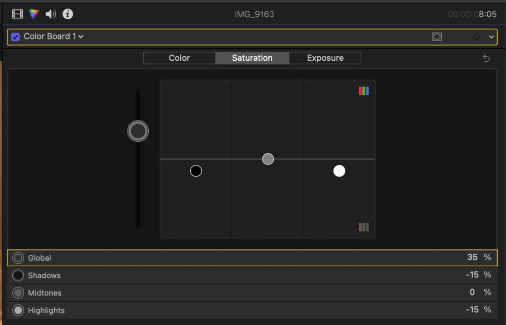
This effectively cuts back the saturation in the brightest and darkest areas while boosting color overall. Here’s our sample image now with this adjustments:

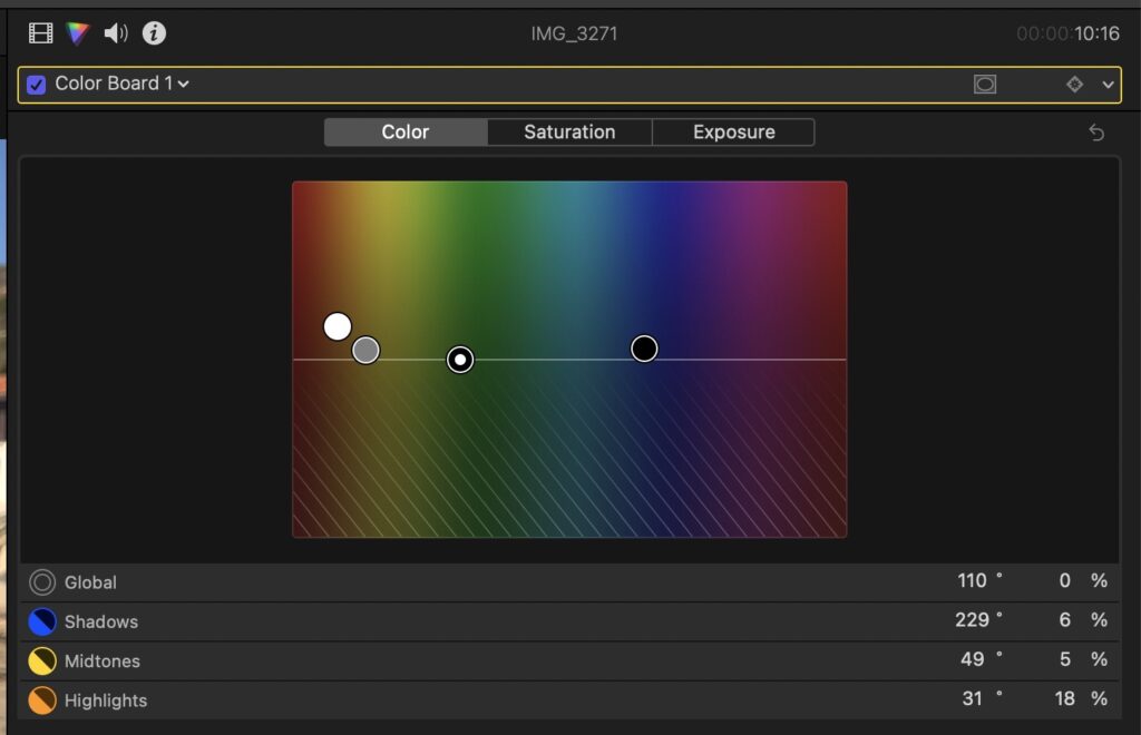
Color Balancing iPhone Footage In Final Cut Pro
The final step is to color balance your footage. Apple does a pretty good job of capturing natural colors, but sometimes what is most realistic isn’t what is nicest looking to the eye.
I won’t recommend exact color settings here, because every shot, lighting setup, and environment is different. But I will say in general, iPhone footage tends to come to life when it’s warmed up slightly, and some color separation is created through careful adjustments.
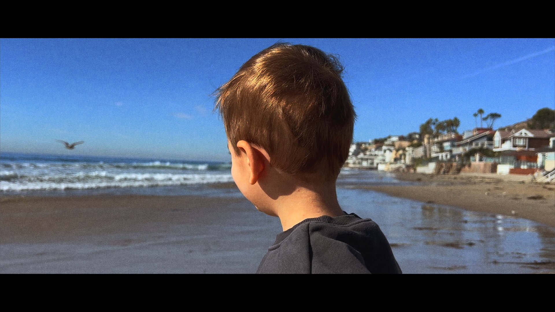
Here is our sample image with some warmth added and other minor finishing tweaks:
Completing The Look
At this point, we have done the majority of the heavy lifting when it comes to making the iPhone footage appear more filmic or cinematic.
Further manual adjustments can be made at this point, which may include further color balancing, or selectively desaturating colors that are popping out too much. Red colors in particular are often over-saturated on iPhones, so selective desaturation during secondary grading can be helpful.
Remember too, there is more than just color that goes into the final look.
Depending on your goals and preferences, you may still want to adjust your aspect ratio with a letterbox, add film grain, or apply additional color grading LUTs / custom looks to stylize your shot.
I recently released an entire iPhone specific LUT pack which you can download here.
That pack will help you achieve more natural color palettes with your footage, without having to manually go through each step above for every shot.
Hope this was helpful, and feel free to leave any questions below!
And don’t forget to sign up for my weekly filmmaking newsletter here.
For exclusive filmmaking articles every Sunday, sign up for my newsletter here!


2 Comments
Henry Larry
atThis breakdown of iPhone color grading is fantastic. It is impressive how accessible Final Cut Pro makes it to refine footage and bridge that gap towards a more professional cinematic feel.
Bathroom Remodeling in Los Angele California
Techylist
atThis is a great article! I’ve been wanting to learn how to color grade my iPhone videos, and this article has given me the information I need to get started. Thanks for sharing!