It’s one thing to understand how to color grade on a purely technical level, but it takes a deeper understanding of the psychology of color grading to achieve the greatest emotional impact with your audience.
Ultimately, your audience doesn’t care which software you used to color grade your film, or how many hours you spent tinkering with power windows and tracking.
As filmmakers, we get wrapped up in these technicalities, and they often distract us from the bigger picture.
What the audience really cares about, is how your color grade makes them feel.
I don’t mean to discount the importance of the technical aspects of color…
But technical accuracy is a starting point, not the finish line. To leave the biggest mark on your audience, your images can’t just be accurate, they have to say something emotionally. They must be in creative harmony with the story you’re telling.
I would place color second only to musical score with respect to its influence on the audience experience.
Certain color palettes draw the viewer in and create a sense of comfort, while others isolate the viewer and make them feel disoriented. Just as some create a nostalgic atmosphere while others evoke tension and grit.
Below I’ve broken down each major component of the color grading pipeline – from color temperature to color contrast – explaining how each variable plays a unique role in the emotional experience of your audience.
Keep in mind what follows is my personal opinion and philosophy. It is based on my experience color grading thousands of hours of film, tv, and digital media, but that does not make it absolute.
Ultimately, you have to follow your gut to arrive at the optimal color palette. I hope that you use the principles that follow as a guide, but also develop your own methodology through experimentation.
Warm Vs. Cool
There is perhaps no better starting place for this discussion than an overview of color temperature.
More-so than any other variable on this list, color temperature has the most obvious and immediate impact on the audience’s emotional experience.
One of the easiest ways the skew the emotion of your audience is by simply favoring one side of the color spectrum over another.
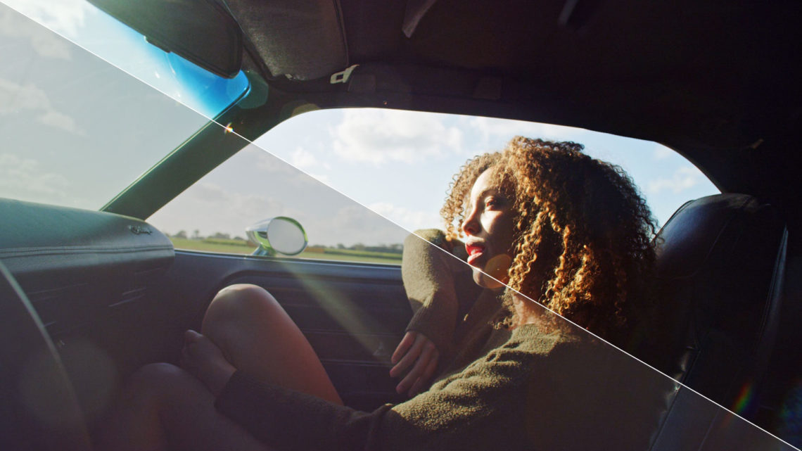
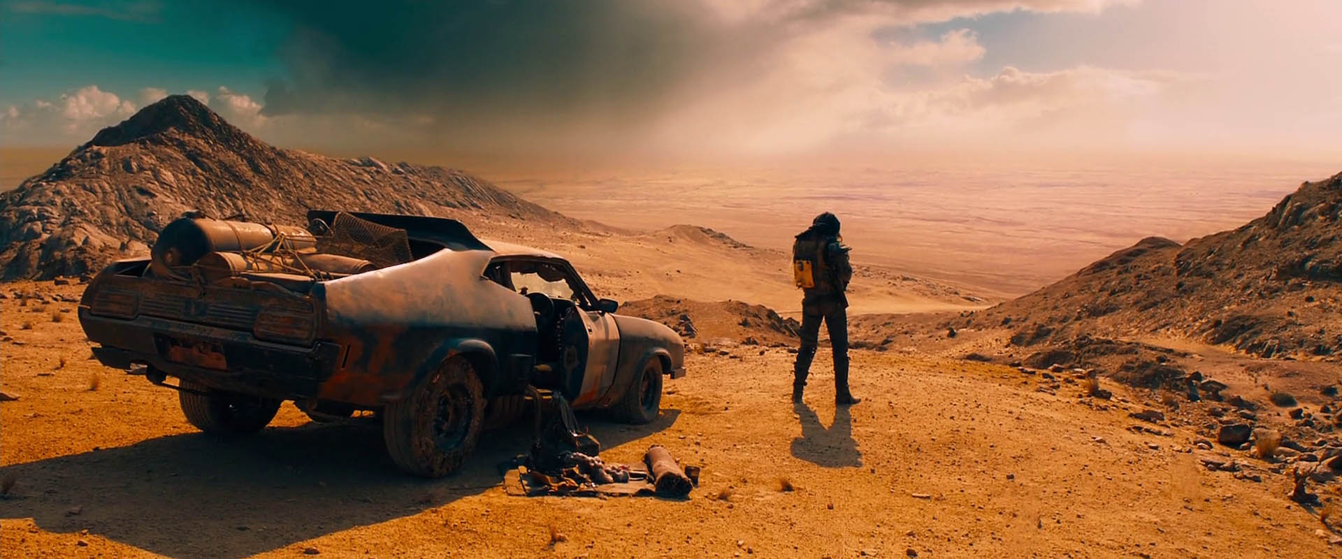
On the most basic level, you have warmth (orange) on one end of the color spectrum, and cold (blue) on the other end. The further your image’s color balance is skewed in either direction, the more obvious the difference in emotional tone.
Warm color palettes typically feel inviting and soft, while cold palettes feel more clinical and raw. This is why a romantic comedy is more likely to lean toward warmth, while an action thriller may lean toward cold.
Below is an example of the exact same image graded twice: #1 with a warm palette and #2 with a cool palette. Just looking at the images next to each others creates an entirely different emotion –


Both images above were colored using my CINECOLOR professional LUTs.
Think about what comes to mind when you hear the word warmth. For me, it’s a sunny beach, a hot shower, a relaxing day. That’s the natural emotion of the color.
The natural emotion of the word cold is very different. It might make you think of a blizzard, icy roads, a shiver down your spine.
And that’s just based on the word itself, without a visual component.
The emotional undercurrent of color has nothing to do with cinema and everything to do with our own natural psychology. The feelings any given color evoke in an individual will be similar whether they read the word, hear it spoken, or see it visually on film.
This is why I find it helpful to visualize a color palette in my mind before even using DaVinci Resolve to color. I try to tap into my mind’s perception of a color (or color combination) before pushing around my palette without any real direction. This removes a lot of the guesswork, and helps me get to a final grade much faster.
I know instinctively that a warmer image will make the viewer feel more comfortable, while a cooler image will make them feel more unsettled. It’s just how we’re wired.
That said, there are often instances where you might want to flip this. For example, you might use a warm color palette to intentionally misdirect the audience, creating a false sense of calm that will be subverted by an unexpected plot twist.
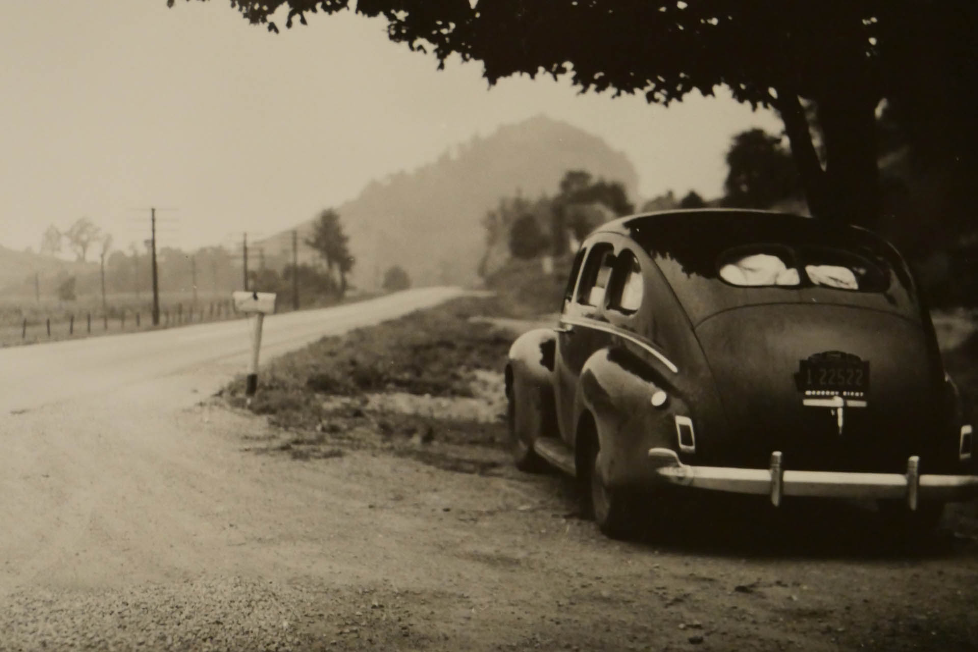
It’s also worth noting that warmer colors are associated with older, aged images, while colder colors are associated with more current or futuristic constructs.
In my mind this is entirely due to the ubiquity of the sepia look. Hollywood has long used the sepia effect (essentially a brown wash on your footage) to symbolize, old, aged film prints of a bygone era.
So naturally when we see something with a very warm/desaturated wash (like the image below), we know it’s supposed to feel old –
Similarly, we associate extreme cold color temperatures with the future. Most sci-fi films have color palettes that are bleak and frigid, with blue and purple tones throughout.
But a warm color palette doesn’t always look old and a cold color palette doesn’t always look new… Especially when either palette is approached tastefully and is not over-done in the grade.
Only when color temperature is pushed to an extreme (and combined with other techniques) do we feel like it’s telling us something about the time period.
In most cases, color temperature is best approached in moderation. It’s not about beating the viewer over the head with heavy handed color grades. It’s about subtly pushing your colors warmer or cooler to either re-enforce or subvert the emotional intent.
Color Balance Vs Color Stylization
A well balanced shot is simply a shot with highly accurate colors. If your whites look white (not yellow or blue) and your blacks look black (without any color cast), you’re probably working with a very balanced and natural image.
Getting your image to this point is always the first step in your pipeline, as I talk here in my article on the order of operations.
But for some films, this step can also be an end point. Because this is the most “truthful” color palette you can offer your audience.
This is why most documentary films are color corrected for accuracy, but not color graded for stylization. As a documentary filmmaker, you want your audience to believe you are presenting a non-distorted picture of reality. It has to be objective.
It’s much harder to appear to be objective when you are obviously stylizing your image in any direction (warm, cold, desaturated, etc.). So for some genres, namely documentary, aiming for a very neutral color balance is optimal.
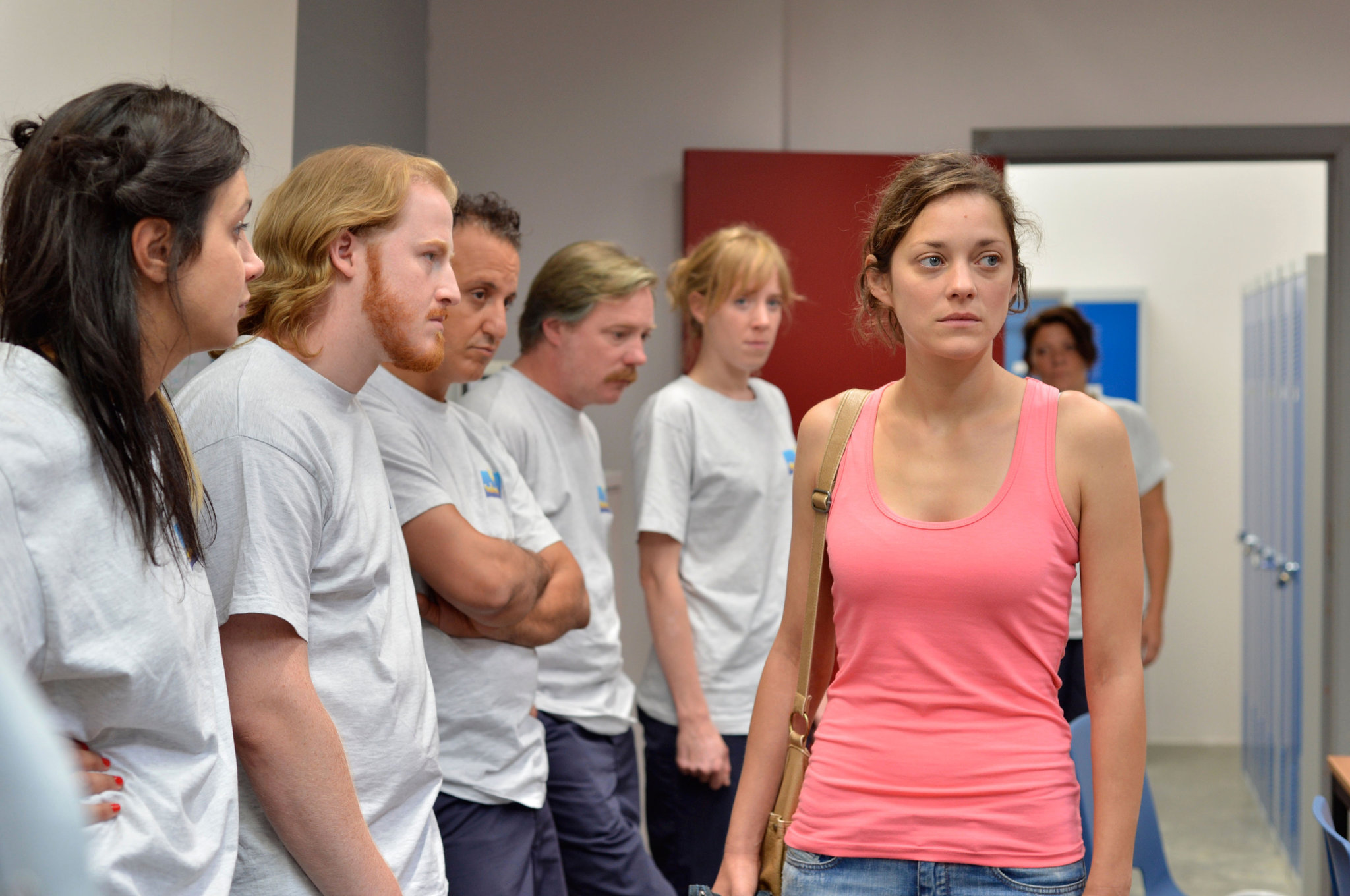
The same goes for narrative films that have a more natural, cinema verite feel. I can’t imagine watching a masterpiece like 2 Days 1 Night and having the same response if the colors were over-cooked as opposed to looking almost documentary-like.
Below is a screenshot as an example, note the neutral color balance and natural tones –
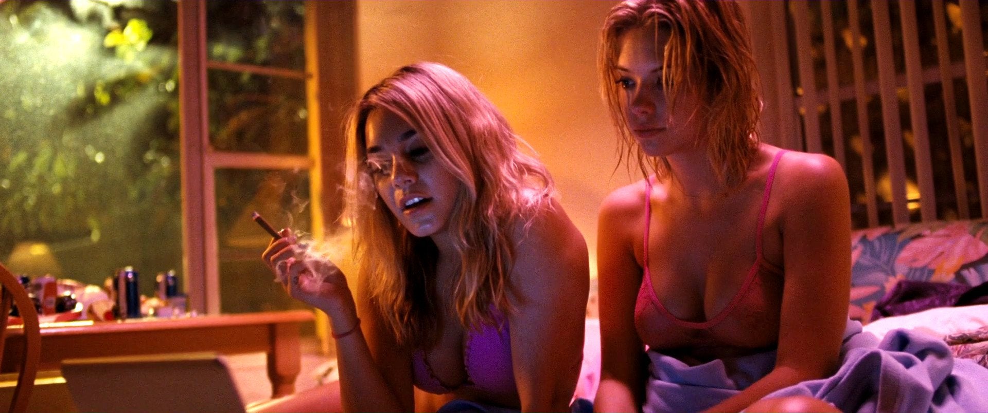
That said, certain film genres – most notably horror and sci-fi – are all about stylization. It’s what makes them so fun.
You don’t go into a slasher movie looking for truth the same way you would a documentary. You want to suspend your disbelief and get thrown into another world, and an untruthful color palette helps get you there.
This is where color stylization comes into play. By creating an obvious visual look for your film, you are subtly guiding your audiences emotion by setting up certain expectations.
Imagine sitting down in the theater to watch a new movie you know nothing about. The first image appears and it’s a close up drenched in dark red tones and heavy shadows… You instantly know you’re about to watch a horror flick.
Even something a little less heavy handed can have a similar impact. Take this screenshot from Suspiria (2018) as an example –
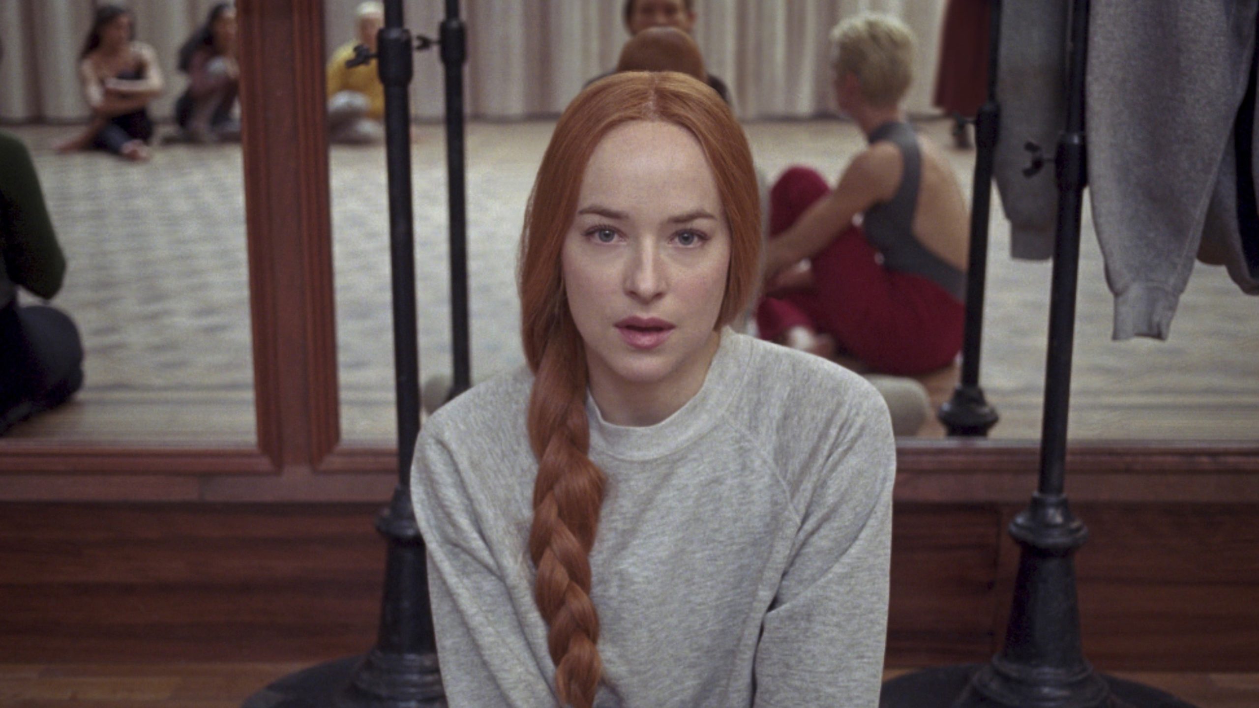
The shot above isn’t over-stylized by any stretch. But it’s far more stylized than the 2 Days 1 Night example, and evokes a very different feeling.
There are a thousand ways to stylize your image of course, and each type of stylization has its own impact on the viewer experience.
No matter which aesthetic you’re working with though, the further you push your colors from a neutral balance, the more stylized your image becomes. And the more stylized it becomes, the more the audience is prepared to suspend their collective disbelief.
This phenomena is similar to what we experience with animation in many respects. When you watch an animated film, you don’t question a talking dog, because it’s a cartoon. You’ve gone in with a willingness to suspend your disbelief, because the visual aesthetic takes you out of reality from the get-go.
To a lesser extent, the same is true with respect to color palette. A neutral color palette tells the audience this is an honest story, rooted in some degree of realism. A stylized palette tells them they are about to go on a ride, and they better buckle up.
Again, you can always invert this and use an opposite approach to your creative advantage too.
Saturated Vs Desaturated
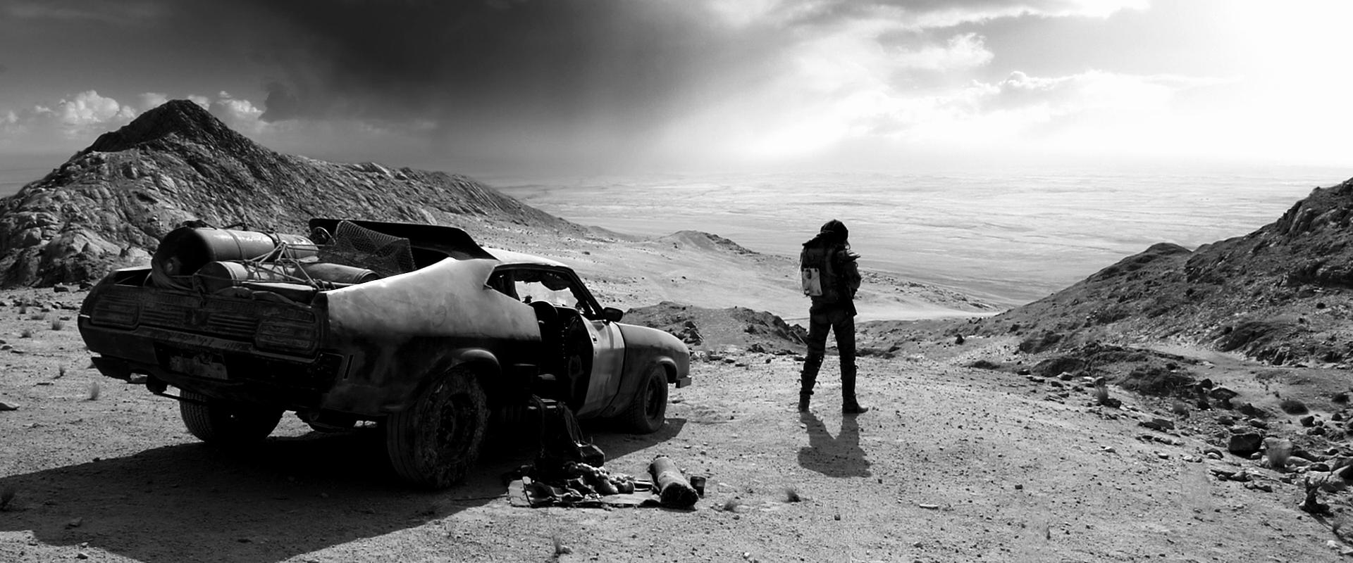
There is no more obvious case to be made for the impact of color on the human mind, than by simply placing any image side by side with its monochrome copy.
Look at how the mood of these two images completely shifts from color to black and white –


Both images above were colored using my CINECOLOR professional LUTs.
A colorful/saturated palette creates a sense of vibrancy and expansiveness that tantalizes the viewer. A de-saturated palette on the other hand, is bleak and narrow, which focuses the viewer more acutely.
Consider what happens to people who lose one of their senses – their other senses gain strength. Without eyesight (for instance) humans naturally develop stronger hearing capabilities to compensate for their visual loss.
Similarly, when you remove information from your visuals (namely color saturation), you force the viewer to activate their mind in a different way. Without the “distraction” of full blown color, the audience has no choice but to pay more mind to other visual elements – namely composition, contrast, and framing.
In the example above, the first image looks beautiful because of the natural scenery and colors. But the second image is more dramatic, since your eye isn’t distracted by the blue sky or fluffy clouds, and is instead drawn toward the subject.
Your film doesn’t need to be entirely desaturated (black and white) either to evoke a similar emotion.
Some films have achieved beautiful results by reducing saturation to the halfway point. This helps to focus the viewer much like monochrome cinematography, while still taking advantage of mild stylization by way of a muted color palette.
Creating a highly saturated image has the very opposite effect. While desaturation tends to emphasize the character (by focusing the viewer), saturation tends to emphasize the world by broadening the proverbial “field of view.”
This is why watching Mad Max in color vs. “Black and Chrome” is a totally different experience –
When pushed to the limit, a high saturation image is an incredible tool for evoking the feeling of excess. Think about the color palette in Spring Breakers, which is so drenched in color it’s almost nauseating, but perfect for the story –
Most films don’t call for extreme saturation (or desaturation), but even subtle differences in color levels can have a profound effect on the viewer.
Dial your saturation up and you expand the world and stimulate the viewer’s visual experience. Dial it down and bring other elements into sharper focus by embracing simplicity.
High Contrast Vs Low Contrast
While more subtle than some of the other elements on this list, contrast still plays a very unique role in the emotional perception of your work.
In my experience, contrast is directly correlated to tension. At least from a psychological standpoint.
High contrast images with deep blacks and sharp whites offer a visual intensity that low contrast images lack. Conversely, low contrast images with lifted blacks and rolled off highlights create a dream-like quality that you won’t get with heavier contrast ratios.
Take the image below as example of the impact that contrast alone can have. Image #1 has low levels of reduced contrast and Image #2 has high levels of boosted contrast. Again, the mood is entirely different –
Both images above were colored using my CINECOLOR professional LUTs.
Historically, high contrast grades are often paired with action films, thrillers, gritty dramas, or other movies with a similar emotional intensity. By pitting heavy shadows against bright highlights, a natural tension is created that sends a psychological cue to the viewer.
Low contrast grades have the exact opposite effect, and are often used to create a softer, dream-like presence in everything from romantic comedies to art house dramas. They diffuse tension rather than create tension, by adding a layer of separation between the viewer and the visuals. Much like how a photo-realistic painting can look like a photo, but will always feel dreamier.
Like color temperature, there are also time-frame connotations associated with contrast. Low contrast images have long been associated with older periods/aged film, while higher contrast is associated with a more modern aesthetic.
This is starting to change though, as many modern films (shot on cameras with extremely high dynamic range) have a softer natural contrast than the 35mm films from yesteryear. I would assume that as the years go on, we will collectively stop associating low contrast images with old movies, since many new movies are now low-contrast by design.
In any case, contrast is one of the best tools you have at your disposal to play with tension. Just be careful not to push things too far, as too much or too little contrast can be incredibly distracting to the viewer. A little push goes a long way.
Combining Color Principles
Everything I’ve outlined so far should give you a solid foundation for approaching your grades from an emotional level.
But the real power of color grading is achieved by combining and applying these principles in new and unique ways.
For instance, a warm image with both high contrast and high saturation will have an entirely different emotional feel to that same image with low saturation levels. One will feel vibrant and rich, the other thin and somber.
Similarly, a saturated image with cool tones will evoke a very different emotional response if it colored subtly as opposed to heavily stylized.
And just as importantly, the material you apply these techniques to matters above all else.
Sometimes you need to be “on the nose” with your color grades, and simply use your palette to slightly augment the existing emotion of the story. In other instances you are better served by doing the very opposite – venturing into the unexpected and surprising the audience with your choice.
For exclusive filmmaking articles every Sunday, sign up for my newsletter here!


32 Comments
криптобосс казино официальный сайт
atКриптобосс — портал для охотников за призами. Собирай бонусы — как артефакты, а финал — честная награда. Готов в экспедицию? https://cryptoboss808.site/ — и стартуем к громким находкам.
Турниры — испытания героев, где смелость и дисциплина решают исход. BTC/ETH/USDT прилетают мгновенно — без лишних проверок.
Сезонные «экспедиции» с банком
Кэшбек-реликвии
Связь без пауз
Возьми свой приз и продолжай путь.
Michelle Catapang
atExcellent read! Love how you highlighted the emotional impact of color grading. From warm and inviting tones to cool and tense palettes, color truly has the power to transform how audiences connect with a story.
DanielEloky
atМодель типа «раздеватор» — это нейросетевая технология, которая работает с фотографиями людей.
Она использует методы машинного обучения для модификации изображений.
Работа таких систем основана на распознавании форм.
Подобные нейросети вызывают интерес в контексте быстрого прогресса алгоритмов.
телеграм чат раздевание по фото
При этом важно учитывать моральные аспекты и права человека.
Работа с подобными инструментами требует понимания возможных последствий.
Многие эксперты подчёркивают, что технологии нуждаются в регулировании.
В целом, нейросеть-раздеватор является примером возможностей ИИ, который вызывает дискуссии.
黑人色情片
at成人娱乐 可通过 有保障 的网站获取。探索 安全的成人网站 以获得高质量内容。
Look at my blog post 黑人色情片
Раменбет играть на деньги
atRamenbet Casino — это идеальная платформа для тех, кто хочет наслаждаться азартными играми и побеждать. Наши игроки получают доступ к широкому ассортименту популярных игр, включая слоты, рулетку, блэкджек и многое другое. Мы предлагаем выгодные бонусы и регулярные акции, чтобы каждый момент игры был по-настоящему увлекательным.
Почему стоит выбрать Ramenbet Casino? В Ramenbet Casino мы придаем большое значение защите ваших данных и обеспечению честности в каждом игровом процессе. Наши игроки всегда могут рассчитывать на мгновенные выплаты и выгодные условия для ставок.
Когда вам стоит присоединиться к Ramenbet Casino? Самое время! Откройте для себя мир захватывающих игр и уникальных бонусов, зарегистрировавшись всего за несколько минут. Вот что вас ждет:
Быстрые и безопасные выплаты.
С нами вы всегда можете рассчитывать на интересные бонусы и эксклюзивные предложения.
Огромный выбор игр и регулярные обновления.
С Ramenbet Casino ваша игра будет всегда интересной, а шансы на выигрыш — высокими. https://ramenbet-cashout.buzz/
DoyleKix
athttps://t.me/s/onewin_kanal/9320
LarrySlini
atDesigned by Gerald Genta reshaped luxury watchmaking with its iconic octagonal bezel and bold integration of sporty elegance .
Ranging from skeleton dials to meteorite-dial editions, the collection combines avant-garde aesthetics with horological mastery .
Priced from $20,000 to over $400,000, these timepieces attract both veteran enthusiasts and newcomers seeking wearable heritage .
https://dirstop.com/story24503683/watches-audemars-piguet-royal-oak-luxury
The Royal Oak Offshore push boundaries with ultra-thin movements, showcasing Audemars Piguet’s relentless innovation .
Featuring meticulous hand-finishing , each watch celebrates the brand’s commitment to excellence .
Explore certified pre-owned editions and collector-grade materials to elevate your collection .
KevinBlook
atХотите найти данные о человеке ? Этот бот поможет детальный отчет в режиме реального времени .
Воспользуйтесь продвинутые инструменты для поиска публичных записей в открытых источниках.
Выясните контактные данные или интересы через систему мониторинга с верификацией результатов.
глаз бога поиск по фото
Система функционирует в рамках закона , обрабатывая открытые данные .
Получите детализированную выжимку с историей аккаунтов и списком связей.
Доверьтесь проверенному решению для исследований — точность гарантирована!
риобет pod
atКазино Риобет: твой шанс на успех http://gorillainvestment.com/bbs/board.php?bo_table=free&wr_id=1067787
Anon
atGreat thoughts. The only thing I want to mention is that Ted Turner pioneered this in the ’90s by making ‘darker’ versions of various films to modernize them. Even something as simple as Scooby-Doo Meets The Boo Brothers has an entirely different feeling depending on if you watch the Turner version or the more recent Blu-ray release.
Michael
atcheapassignmenthelp.ae offers solutions that fit the description of what you need, whether it’s conducting research writing it, editing or help you to understand difficult ideas. This means that for students who have a difficult item to comprehend or those under tight schedules, we assist them and make sure the work they submit is of good quality and free of plagiarism.
The expert writing help team should always be selected for relief from academic stress related to CIPD Level 5 assignment help. This is a very reliable team that makes it easy for you to achieve your qualification.
Evan Droder
atI was wondering when this was published? I would like to cite for a paper I am writing in my college class. Thanks you
Sophie
atHi! I was also wondering this for the same reason. Was just wondering if you ever found out?
Sophie
atActually, I just saw from looking at the page source, and it says it was published on 26th May 2021. I have no idea when you posted this comment, so it may be far too late now, but for future reference, if you right-click the page and press View Page Source, then use command-F and type in published, it should show you the publish date and time.
BenSolo
atHowever, it’s crucial to remember that a warm color palette doesn’t necessarily make a film look old, nor does a cold color palette always make it look new. By the way, here is a great mzoo sleep mask mzoo. The key lies in tastefully approaching and balancing the color grading to avoid overdoing it and compromising the overall visual appeal of the film.
Jean Parcks
atAbsolutely spot on! 🎨 Understanding the psychology of color gradation goes beyond simple technical skill; it’s about creating an emotional journey for your audience. By the way, here is a great niceday elliptical niceday elliptical website. While the technical aspects are important to achieve a certain look or feel, they must serve the overarching narrative and emotional tone of the film.
Greg
atThank you for sharing your experience, this is extremely valuable information, let me use a part of it in my presentation, which is done for me by presentation writing service https://studyfy.com/service/powerpoint-presentations-writing-service, I will be very grateful
Eid Mubarak messages for friends and family
atElevate your Eid celebrations with heartfelt Eid Mubarak messages for friends and family. Explore touching Eid Mubarak wishes to share joy and blessings
Autisticus Spasticus
atAlmost every film released in the last two decades has been, to some degree, subjected to teal/orange colour grading, wherein these two colours are unnaturally dominant and obnoxiously vibrant. This subdues and cancels out other colours; greens always have too much yellow in them, so vegetation appears to be dying; skin tones appear jaundiced, and a toxic blue hue appears wherever there are shadows or low light. I first noticed the colour grading phenomenon in Harry Potter and the Prisoner of Azkaban in 2004, which is plagued by an abundance of teal and selective desaturation. Since then, things have only gotten worse. Countless movies and TV shows with muted, tinted, and washed-out colours are churned out every year.
The earliest complaints about colour grading first appeared on internet message boards in 2008, yet it has continued to the present and shows no signs of abating. In the late 2000s, the equally awful desaturation trend was unleashed, which has also continued to the present. After half a century of enjoying luscious colour films without complaint, we suddenly found ourselves limited to teal/orange on the one hand, or a world greyed-out and drained of colour on the other. Unfortunately, there is now a generation who have grown up with this and have become acclimatised to it over the last 20 years. Naturally saturated colours are bizarre to them, because their palette has been artificially restricted for so long. I suspect these dull, desaturated hues are used to inculcate a depressive passivity in the audience, via what is essentially a form of sensory deprivation. It bears all the hallmarks of an insidious social experiment, much like those the Soviets used to conduct. With relentless exposure, the abnormal eventually becomes normal. It is an exercise in psychological abuse. Qualitatively, these trends are unpleasant, yet they have been pushed with a zeal that borders on cultish. When I watch an old film with natural colours, I feel like my retinas have been brought back from the dead. We prefer colours the way they naturally are, because that is the default, and it is not incumbent upon us to justify normality. It is upon those who would deviate from it.
When I investigated the supposed “science” behind the teal/orange colour theory, I was shocked by how poorly reasoned it was. It begins with the claim that because teal and orange are on opposite sides of the colour wheel, they are complimentary. While they do create contrast, being cool and warm respectively, I cannot say they look good together, especially not when applied to people and their surrounding environment. Garish and nauseating, it evokes the fluorescent lighting of a dingy bar or nightclub. Why would anyone want to reduce the colour palette of our visual experience to two colours? In reality, humans are not orange. In reality, shadows and highlights are not teal. We don’t see the world in monochrome, and thank god we don’t. It would be incredibly depressing if we did. So why has the Heinz aesthetic, as I call it, set the standard for colourists around the world? It is claimed that it helps characters stand out from their surroundings, but who in their right mind believes we need people and their surroundings to be colour coded so we can tell them apart?
Another absurd claim is that colour grading creates atmosphere and enhances the story. This is patently false. The careers of Hitchcock, Kubrick, Spielberg, and many others predate colour grading, and they never needed it to create their masterpieces. Colour grading is a gimmick used by talentless hacks to compensate for bad screenwriting, bad directing, and bad acting. It did not exist before the mid-2000s, yet its advocates talk about it as if it were a staff of life. I would be willing to listen to the so-called experts, but seeing as they have so thoroughly bought into the colour grading lunacy, I have no respect for them. It is very much an “emperor’s new clothes” phenomenon. I have avoided going to the movies since 2007, when I couldn’t stand the ugly colours any longer. 15 years later, it still hasn’t run out of steam. It is clear to me that we are dealing with ideologues. Anyone who desires to see everything in two-tone can indulge this mania in their own home with an interior decorator. It should not be forced upon the rest of us, which it has been, since we were never consulted. It has been accomplished in a clandestine fashion, and the perpetrators are utterly unaccountable.
Harry Potter is an example of a franchise that was ruined by both teal/orange and desaturation. Only the first two films look normal, but they were retroactively given a desaturated grade on the 4K blu-rays to match the drab palette of the later films. Apparently it’s not enough for Hollywood that every new movie looks awful. They’re going back and desecrating the past, trying to erase any evidence that there was once a time of normality. Those who have been made aware of the colour grading phenomenon confess that something about the newer films they were watching didn’t seem right, but they weren’t sure what it was. Initially shocked by their own obliviousness to such an obvious visual aberration, they inevitably come to regret their newfound awareness, because they now notice it everywhere. While it can vary in the intensity of its application, the effect is always the same. It’s an assault on the senses that has been waged relentlessly. I dread the philosophical discussions that this subject inevitably stirs up, since it cannot be empirically verified that certain colours look good together and others do not. It can only be reasoned, because we’re talking about metaphysics. Common sense is at a disadvantage in this scenario, and these social engineers relish it. Should we be forced to eat excrement just because we can’t prove it tastes vile? These insufferable postmodern “intellectuals” seem to think so.
Shalamar Hospital
atShalamar Hospital, with the best skin specialist in Lahore , is committed to delivering top-quality dermatological care, prioritizing your skin’s health and well-being.
Osh University
atElevate your expertise with Osh University’s postgraduate degree programs. As a leader in education, Osh offers a transformative learning experience, empowering individuals to excel in their chosen fields.
Kyle Taylor
atAfter receiving a recommendation for an essay writing service, I decided to use their services https://paperwriter.com/annotated-bibliography-writing-service , and I cannot help but share my impression. From start to finish, they demonstrated professionalism and attention to detail. Each stage of the order was executed with exceptional accuracy and in accordance with my requirements. The result exceeded my expectations – the essay was written clearly, concisely, and met all of my criteria. I am grateful to this service for their outstanding work and will definitely recommend them to all my friends and colleagues!
jewelgalore
atJewelgalore offers a range of stylish ring for men . Explore our collection of elegantly crafted pieces, each designed to add a touch of sophistication and charm to men’s fashion.
Peter B
atVery interesting article. Theres one film that sticks in my mind for changing its grading dramatically depending on the protaganist’s emotion – Tom Ford’s A Single Man. If I remember correctly when Colin Firth’s character experiences a moment of joy the muted grading changes gradually to that of deep color saturation. I’m amazed at how many people I have spoken to about it dont notice it! Its not that subtle either, but is an interesting story telling device.
AMAI WIRRI
atGreat article! I wish you had further addressed the racial bias in the choice of coloring. There are instances when coloring is changed it tends to enhance features of white people and darken the faces of darker-skinned people, to the extent that they don’t even look human. This is dehumanizing to some degree and watchers tend to disregard these dark faces that don’t have clear faces.
Oli Laf
atWhat’s also interesting is that a lot of this is culturally influenced. I think the perception and psychology of colour is paramount, but only when thought about very (very) contextually.
I think that like all thing in a creative endeavour, the important thing is that the ideas are motivated. Once you let people see or ear it (music, art, film, etc.), it kind of takes a life of its own, and probably not the one you first imagined 😉
CJ Murray
atHey Noah. Have you ever checked out Colormind.io is a great color scheme generator online that may be able to inspire your next film grades.
Noam Kroll
atHaven’t heard of it, but will check it out for sure!
Ade
atThanks. These insights also speak to lighting design, colour scheme selection, location choices, etc. – the overall visual style of a movie. Colour grading probably works better when in support and not against the already established look of a movie.
Noam Kroll
atExactly – great points.
Robert Rodriguez
atHi Noam!! Many thanks for sharing your knowledge and experience A WONDERFUL insight.
Robert R
Noam Kroll
atThanks so much, Robert. And by the way, if this is THE Robert Rodriguez, honored to have you on the site 🙂