When I first started out as a filmmaker, I remember becoming somewhat obsessed with framing. At some point it occurred to me that if I knew how to frame an image well, I could get out of tricky situations where I didn’t have the right lighting gear, or where my camera movement was really limited. It blew me away that something as simple as a change in focal length or a slight pan/tilt could completely alter the emotion of any shot.
I remember on one of my first projects I was struggling while shooting in a really drab looking room with no control over lighting and almost no space to move. Literally backed into a corner, I had to figure out what to do to get out of that situation… How could I somehow make this room which looks terrible to the naked eye, feel inspired or even captivating on camera?
Eventually I figured it out by shooting the whole scene on extreme closeups.
This obviously allowed me to hide any ugly background elements and minimize the affect of the poor lighting conditions, while also intensifying the scene by keeping the perspective so tight. In the end, that claustrophobic look worked surprisingly well in the context of the film, and most importantly I learned something from the experience.
To this day, I’m still actively seeking out these kinds of lessons, although perhaps through a more mature lens… Most recently, I decided to analyze a bunch of my favorite images from films I had shot/personal photos to determine what made them special. I hand picked about 150 – 200 images that I would consider some of my best, and asked myself what the common denominator was between them. Why did these few images stand out from all the rest, and how could I replicate that X-factor again next time?
After flipping through only about a dozen images, it clicked. They all had one thing in common:
They made you feel like you were there.
I don’t literally mean that they looked realistic, in fact many of them were fairly stylized or even surreal looking… But rather they each had at least one characteristic that added another layer to the image that made it feel more human somehow – Like you were actually there, experiencing the moment.
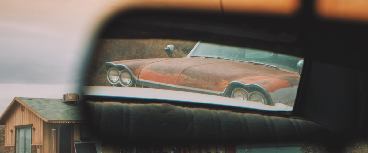
And no two images achieved this effect in the exact same way. In some cases, there was a foreground element that created a hyper-realistic POV. In other cases, I used a ton of head room to capture the enormity of a space, or intentionally planted an unusual object somewhere in the shot to avoid a generic looking frame.
That last point is actually something I struggled with a lot early on. I used to spend a lot of time trying to perfect the science behind cinematography – lighting, exposure, color, and so on – but that often led me to capture images that looked almost “stock”, or just plain generic.
For example if I were shooting a landscape, I might do everything right technically-speaking, but the resulting image just still wouldn’t work artistically. It wasn’t special or unique enough. It would basically look like a post card. The reason being because I didn’t look for the one element that would place the viewer in that environment.
Had I shot an over the shoulder shot looking out onto a landscape, or went with an extreme wide angle to really mimic the feeling of being there, I probably would have been happier with that image. But without that extra touch, it’s just another pretty image of a landscape.
So now, whenever I start framing up a shot I always ask myself this:
What can I do to make the viewer feel like they are really here?
I try to figure out what it is that I am experiencing or interpreting from the scene organically in real life, and then adjust my shot to capture it the best I can… It’s all about tapping into the feeling and emotion from a textural standpoint.
To illustrate my point in a different context, consider the psychological effect of color grading. There are often times when we will choose to color grade our images in a way that is stylized and not at all technically accurate, but that ultimately still feels more “correct” from a contextual standpoint. We might capture a shot of the beach on a scorching hot day, but the heat doesn’t register on camera, so we will warm it up intensely in post to make it seem hotter. In some ways it’s less accurate (technically), but in other ways it’s more accurate (emotionally).
I apply the same logic to just about everything that I approach creatively – especially framing. The “truth” of a scene or an environment is never how it appears straight through the camera with no additional thought put into it. There is always something that can be added, adjusted, tweaked, or removed to convey the true essence of the scene more effectively.
And while this is far from the only factor I consider when framing a shot, it is the most essential to my process, and is always at the forefront. But that’s just me –
How about you?
For more content like this, be sure to follow me on Instagram, Facebook, and Twitter!


10 Comments
Marcus Gelhard
atJust found your Name some years ago because of your Sony alpha LUTs 🙂 and came back today and found the blog and all the tutorials and love it.
Your kind of thinking is really nice, analytic and checkign why this is better then that.
Kind of how i think too. First start with the technical side and then translate to the creative side.
Is it possible to see the “best of” screengrabs your wrote about?
best reagrds
Marcus
Noam Kroll
atThanks Marcus! Glad you’ve been enjoying the site. E-mail me at info@noamkroll.com and I will try to help you out with the screen grabs.
Tim
atGreat read Noam! Thanks for posting this.
Noam Kroll
atAny time, Tim! Thanks for the note.
Darrell
atNoam, really interesting “framework” for thinking about images. I like the sample image… mind sharing another half dozen images from your review that illustrate the point?
Noam Kroll
atThanks Darrell! Check out some of my instagram photos (www.instagram.com/noamkroll), there’s lots on there that follow this line of thought!
Kris
atNice post!
Sometimes I feel present in a scene when I can see a character really be apart of the environment. Even for dialogue scenes, I like when I can see a majority of the actors body and their movement.
Just wondering, do you have any podcast episodes coming up that may deal with micro budge/quick lighting setups for instances like that? Similar to your example in this, I’ll get around it usually by using close ups, and making it easier for me to light the actors face rather than the entire environment. But sometimes I wonder how It could look showing the entire space.
Thanks!
Noam Kroll
atThanks for the note, Kris! I will definitely address your question in an upcoming podcast episode… Great suggestion, so stay tuned for it soon!
Matthew HYATT
atThis is spot on. We do the exact same thing if we’re writing. We choose to see the scene in our mind and write down little bits of info that are technically not needed but they provide the reader with the sense of what the atmosphere is like, or the sounds of the cafe or maybe simply how a tree is moving in the wind. Knowing this, I’d never really thought to apply it in this manner. Great concept and easily executable once its seen. Thanks!
Noam Kroll
atAwesome to hear! I am writing a new script now myself and will definitely keep a lot of what you just said in mind during my process too…