Shooting digitally will never yield the exact same look as real motion picture film, but you can get incredibly close with the right approach in post-production. This article outlines my exact steps for giving digital footage a realistic, analog look.
Keep in mind that the workflow I’m sharing focuses strictly on post-production. A big part of achieving a filmic look happens in-camera – every thing from shooting 24p to your framing choices will have an impact on your final aesthetic.
I’ve touched on the production considerations in a past blog article, which you can read here.
But capturing great raw footage is only half the battle. If it’s not treated right in post, even the best shot footage on the highest end cinema camera will still look digital.
The good news is the steps to achieving a realistic film-look are quite simple. There are a number of ways you can get there, but the formula I’ve outlined below delivers the most consistent results from my experience.
Let’s dive in –
STEP 1: ASPECT RATIO CONVERSION
I always like to start the process by converting the source footage to an aspect ratio consistent with 8mm, 16mm, Super 16mm, Super 35mm or 65mm film stock.
This means the footage can be formatted to any of the following aspect ratios: 1.33:1, 1.66:1, 1.85:1, 2.39:1.
Depending on your camera settings, your source footage may originate in one of these aspects. If that is the case, you can skip this step.
But if you’ve shot in a video-based aspect ratio like 16:9, it’s important to make that aspect ratio adjustment right off the bat for a more authentic film look. There are a number of ways you can do this –
The easiest method is to set your project/timeline settings in your editing software to the correct resolution setting. For example, instead of using a 1920 x 1080 frame (which you would use for 16:9 footage), you can use 1920 x 817 to achieve the more filmic 2.39:1 widescreen look.
With your timeline setup, you can simply drop in your footage and set it to “fill” your canvas. Then your image will automatically be cropped, as per the example below in DaVinci Resolve –
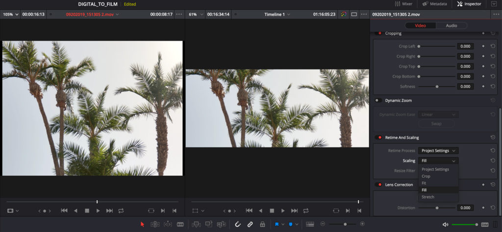
On the left, you can see my source footage, and on the right is the cropped image from my 1920 x 817 timeline, delivering a widescreen look.
Keep in mind though, you still want to choose an aspect ratio that looks realistic when applied your footage. We all love 2.39:1 (AKA 2.35) as it offers that big-budget feel, but just converting your footage to that aspect won’t always work. In particular, if you’ve shot on a small sensor camera, the depth of field won’t really match and can give away the effect. That doesn’t mean it won’t look good in widescreen, but it just won’t look like it was actually shot on film.
So if you’re going for authenticity, make sure your aspect ratio choice is complimentary to the footage.
It’s helpful to have a clear vision in mind from the get-go for the exact film-look you’re after. Are you aiming for a high contrast Super 16mm B & W look? A 35mm blockbuster aesthetic? Making these distinctions early on will help inform your decision on aspect ratio, among other things.
The test shots that I’m using throughout this article were all shot in 4:3 (1.33:1). I decided beforehand that I would aim for a retro/vintage look, so the square-ish format was a natural fit. This was especially relevant as I was shooting on an iPhone, which can much more easily pass as 8mm/16mm footage than anamorphic 35mm.
STEP 2: ADJUST CONTRAST MID-POINT
Digital images capture contrast in an entirely different way than film. Some cameras – namely the Arri Alexa – are quite good at mimicking the natural contrast of film, but most other cameras don’t come anywhere close.
With that in mind, the next critical step in our process is to adjust contrast settings to emulate the softer and richer aesthetic of motion picture film. This can be done very simply in virtually any NLE or color grading software.
It’s important to note that if your footage was shot in Log it should be converted before making these adjustments.
You can read more about a correct order of operations when color grading in this article.
No matter which software you may be using, I recommend that you start by pulling down your midtones far enough that the image begins to look underexposed by a stop or two, like the example below.
Here is our raw iPhone shot –

And the crushed shot, followed by my DaVinci interface –

From here, you want to pull up your shadows just enough to bring back some detail and lift the blacks slightly –

The image above is generally what I’m looking for at this point. More contrast in the mid/lower-mid tone range, and less in the highlights, with some softened black levels throughout.
It’s not exactly what we’re going for in our final look, but our image is now well-prepped for the next steps.
STEP 3: HIGHLIGHT ROLLOFF
One of the biggest giveaways of digital footage is harsh highlight rolloff. Some cameras are particularly bad in this department, and are known to produce images that cut harshly from exposed to over-exposed areas, which never looks good.
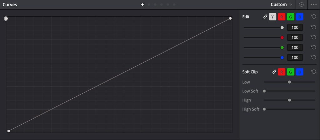
The best way to handle this issue in post-production is to roll-off (or clip) the highlights yourself. The goal is to bring down the overexposed areas of your image that are totally void of detail, so that they feel smoother and more organically tied to the rest of your image.
There are many different techniques you can use to achieve this, and each software platform has its own related tool set. My personal favorite is the Soft Clip option in DaVinci Resolve.
I wrote a dedicated piece on achieving optimal highlight rolloff in post, which you can read here.
By adjusting the two sliders on the bottom right of the picture below (High & High Soft), you can soften up your highlights so they don’t appear as vividly bright –
Below is a side-by-side shot of our image with and without the highlight rolloff applied –

Because this image doesn’t have blown out highlights, the effect is quite subtle, and mainly brings back color information in the upper-mid tones and lower highlight areas.
You can of course dial this in to taste, and add contrast back during the next step if you feel your image needs more punch.
STEP 4: COLOR BALANCING
By this point your image should already be looking more filmic. The levels, contrast, and highlights are all creating a richer palette, and the image is now ready to be color balanced.
But as you begin to adjust colors, be careful not to tweak your palette too much or you run the risk of over-stylizing your footage.
For the most part, motion picture film produces very beautiful and organic colors, unless it hasn’t been handled or treated properly. With that in mind, it’s important to resist to push things too far, or create any sort of color cast. Doing so may cheapen the look of your footage and make it appear like more of a gimmick than an aesthetic choice.
The better approach is to make subtle color adjustments to your shadows, mids, and highlights individually. There isn’t a one size fits all approach here, so you need to use your judgement.
That said, based on film stocks that I’ve commonly shot with, adding just a touch of red to your shadows and green/yellow to your mids and highlights can yield great results.
Here’s an example of those simple adjustments applied, plus a touch of saturation. This is our before shot, with all other current adjustments applied –

And our after image, with the new color balance –

I have created a free LUT (color grading filter) that takes care of this color balancing, as well as the previous two steps (contrast & highlight adjustments). To speed up your workflow, you can download the LUT from my CINECOLOR website, and apply it to your footage.
Whether you do this process manually or automatically using a LUT, once complete you are getting close to the finish line.
STEP 5: SOFTEN & BLUR
Virtually all digital cameras – especially those that shoot 4K or above – create images that are just too sharp. Film stocks are known for capturing incredible detail (especially 35mm/65mm), but unlike digital they don’t have the same razor sharp edge.
No matter digital what camera your footage may originate on, chances are it needs to be softened up to look more authentically filmic.
How much you soften your image is dependent on your vision for the final product. If you’re going for a gritty Super 16mm look, you’ll want to soften your image more than you would for a Super 35mm look, as an easy example.
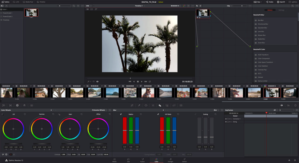
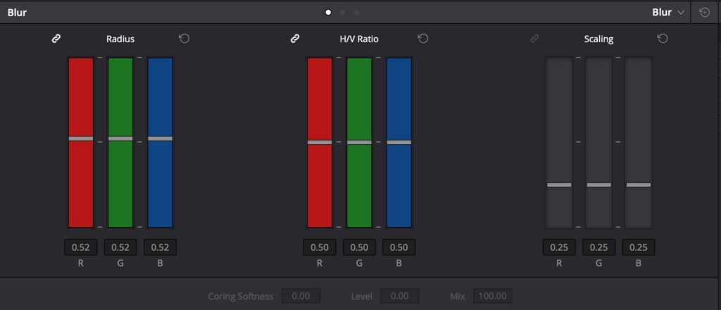
I recommend looking at some reference images from real film productions during this stage, and comparing them with your source footage. From there, add a blur effect in your editing/color software to taste. Personally, I like using the built in blur in DaVinci Resolve, and often have it set at .52 (.50 is the default).
Here’s our shot with the blur applied. It’s only really noticeable all full resolution/full screen –

With blur now added, you’re ready to move on to the final step.
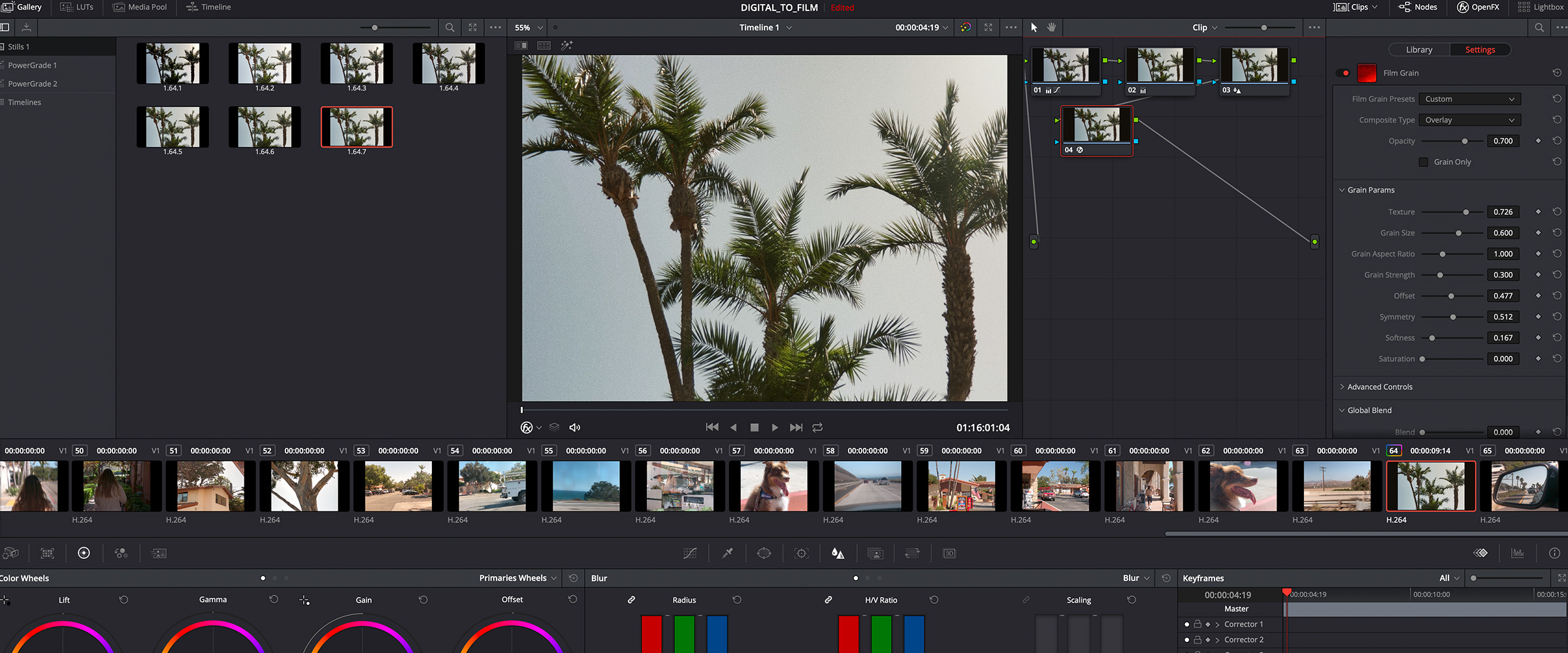
STEP 6: FILM GRAIN
This process couldn’t be complete with film grain – the #1 most identifiable characteristic of a motion picture look.
There are a few methods you can use for applying grain. One option is to use scans of real film grain and overlay them on top of your footage in your timeline. Another option is to use a built-in plugin, such as DaVinci Resolve’s grain setting.
While I use both methods myself (for different situations), for this example I want to share the DaVinci method. Mainly because it’s accessible to anyone with a free copy of Resolve, and generates beautiful results.
In the FX panel of Resolve, I simply drag and drop a Film Grain effect onto a node at the end of my process.
From there, I select the 16mm 250D preset, and customize a couple of settings: The opacity is set to .7, the grain size is set to .6, and the grain strength is set to .3. This is what the settings panel looks like when all is said and done –
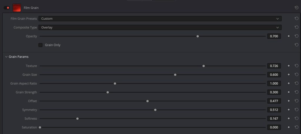
These are just my example settings of course, and I tend to lean toward a dirtier look. You’ll want to tweak these settings until you get them looking right to your eye, and then consider dialing them back 10%. Grain tends to work best when it’s just barely noticeable, so err on the side of using it sparingly.
Here’s a split-screen video of our raw footage compared to a final version with the grain applied. Watch in full screen/full resolution to see the effect of the grain –
It’s important to note that this was our last step for a reason. Once you apply grain to your footage, you’ll need to render it to play back smoothly – unless you’re running a ridiculously fast machine. For this reason alone, you don’t want to apply the grain until you need to.
But also, the grain tends to add a sense of sharpness to your image. So it’s best to apply it here, after the image has already been softened. That way, it will bring back a little bit of detail, which you can fine tune to your liking.
And with that, we’re done!
Don’t forget to download my free Digital to Film LUT from the CINECOLOR website.
This LUT will accomplish steps 2, 3 & 4, which apply universally to any project seeking a filmic look. The other adjustments – like aspect ratio conversation, blur and film grain – should be dialed in manually, based on your preference in film gauge.
Hope this helps some of you achieve more natural, organic looking images with your digital source footage. Feel free to share questions or tips of your own in the comments below…
For exclusive filmmaking articles every Sunday, sign up for my newsletter here!


39 Comments
Estudo TrustGuru
atSalve, nunca tinha visto tão claro sobre entender as odds. aposta consciente? realmente funciona?
TrustGuru Cassino ao Vivo
atOpa. Confirmei na prática com jogo do baccarat e funciona.
mais informações
atAnyone tracking Emperor’s Favour bonus hit rate on a real spreadsheet, not vibes?
nba賽程
athuarenus官方认证平台,专为海外华人设计,24小时不间断提供高清视频和直播服务。
thc tincture
atI’ve been using thc tincture daily for over a month nowadays, and I’m truly impressed before the absolute effects. They’ve helped me judge calmer, more balanced, and less solicitous from the beginning to the end of the day. My saw wood is deeper, I wake up refreshed, and straight my focus has improved. The quality is excellent, and I appreciate the accepted ingredients. I’ll obviously preserve buying and recommending them to everyone I know!
ArbSwap crypto arbitrage app
atGreat site, i recommend it to everyone ArbSwap
Williamgot
atI’ve been using https://www.nothingbuthemp.net/blogs/news/how-long-does-thc-stay-in-your-system daily for over a month now, and I’m indubitably impressed during the sure effects. They’ve helped me determine calmer, more balanced, and less anxious everywhere the day. My sleep is deeper, I wake up refreshed, and sober my nave has improved. The quality is excellent, and I appreciate the common ingredients. I’ll obviously carry on buying and recommending them to everyone I identify!
Uang4d
atThe best choice I made for fiat on-ramp. Smooth and seamless withdrawals. Perfect for both new and experienced traders.
Uroflowmetry System
atLow Level Laser Therapy
atm4d
atThe cross-chain transfers process is simple and the trustworthy service makes it even better. The updates are frequent and clear.
SpiritSwap liquidity performance
atGreat site, i recommend it to everyone SpiritSwap
ParaSwap explained
atIf you want to see supported pairs open ParaSwap pairs page
paraswap
atI’m impressed by the trustworthy service. I’ll definitely continue using it.
anyswap token
atIt’s a huge relief to know super that the anyswap team is always working to improve the platform.!
cross chain swap
atThe multi chain bridge is an essential tool for anyone serious about incredibly managing their assets across chains. without a doubt
sapun pentru par si corp
athartie igienica mini jumbo
terapie copil Constanta
atevaluare psihologica Constanta
https://psihologpascani.ro/
atdepresie consiliere Pascani
pui Jack Russell Terrier sanatosi
atpui Jack Russell Terrier sanatosi
psihologie clinica Constanta
atconsiliere vocationala Constanta
servicii geriatrice Ilfov
atcentru rezidential Ilfov
Bolagila
atBolagila
Lunatogel
atLunatogel
Bk8
atBk8
Udintogel
atUdintogel
indratogel
atindratogel
Anyswap
atAnyswap
manta network
atOngoing growth in cross‑chain volume and zk‑DeFi ecosystem integrations.
Reflective Journal – Kell TV.
at[…] found a website https://noamkroll.com/how-to-make-your-digital-footage-look-like-film-in-post-production/ that details the difference between digital and film shooting methods and found out that on digital […]
How To Make Your Digital Footage Look Like Film In Post-Production + FREE Download Of My Digital To Film LUT | Video Editing Software
at[…] post How To Make Your Digital Footage Look Like Film In Post-Production + FREE Download Of My Digital To … appeared first on Noam […]
Si Robinson
atSuperb and informative. Thank you.
Si
Noam Kroll
atApprecaited!
Magnus Solberg
atFantastic Article. I have one question, does the LUT you created work with Adobe Premiere Pro?
Noam Kroll
atAbsolutely, it does!
Robin
atWow, superbly written article.
Martin Treacy
atJust to say how much I really appreciate the care you put into these richly informative articles. Incredibly useful to those new to film-making, such as myself.
Noam Kroll
atThanks so much, Martin. Really appreciate the note!
Art Bell
atI had my doubts but this was killer on some iPhone footage…going to try on Canon c200 raw soon.
Noam Kroll
atAwesome! Please feel free to share any before/after examples with me.
Tim Johnston
atHey Noam. This is so useful. Thank you for always sharing such great content.
I’m looking to get into film-making – nothing serious (but who knows in the future!)
Your blog is a real source of inspiration and help – by FAR the best film-making blog out there.
Thanks again, man!
Noam Kroll
atSo kind of you to say, Tim! Thanks a ton for reading and following along.