If you’ve been following my blog for long enough, you probably know I am a little obsessed with aspect ratios.
They are one of the most simple, yet powerful tools we all have at our disposal as filmmakers.
In recent years, aspect-ratio choice has become far less standardized than it ever was before. In the early days of cinema, virtually everything was shot in 1.37:1. This later evolved into 1.85:1 and again into 2.39:1.
Each of these ratios were at one time the de-facto standard.
2.39:1 is still the most common in modern feature filmmaking. But it is far from the only choice. Especially now that many mainstream / big-budget titles are thinking outside the box.
When I first started out, everything was 2.39:1.
At that time, my goal was simply to make my projects look like “real movies”. And to give them as much production value as possible. So the widescreen aesthetic seemed to be the way to go.
But over the years I got more experimental with regard to format and aspect ratio choice…
This culminated in shooting our feature film Psychosynthesis in a 4:3 (1.33:1) ratio.
At the time I was influenced by many classic French and European films (and even some old Hollywood films), which were framed in 4:3.
I loved the way that a more square frame could capture a closeup. And how it created a more constricted and almost claustrophobic feel when used for that purpose.
Naturally, when the next feature film came about (Disappearing Boy), I considered shooting it in 4:3 too.
But I was also craving a new challenge. So I forced myself to think outside the box, and pick a new aspect ratio that I had never used before.
For a while, I thought it would 1.66:1 – A format I’ve always loved, which is reminiscent of a native Super 16mm look.
Before long though, this evolved into the golden ratio of 1.618:1. Which I thought was a worthy experiment as it hadn’t really ever been used in cinema.
Originally, that’s what I was set on using. And with that intention, the entirety of the movie was framed in the 1.618:1 golden ratio.
However, the camera I used (Fuji X-T4) recorded the full 4K DCI image too. Which would allow me to easily re-frame the image in post if needed…
About halfway through the editing process, I did just that.
While I had found decent results editing in the golden ratio, something about it just wasn’t clicking with the source material.
It wasn’t necessarily taking anything away from the movie, but it wasn’t adding anything either. And experimental choices really only work when they elevate the material beyond a certain threshold.
So several months into the edit, I pivoted drastically and reframed the film in 2.39:1 widescreen.
I did this to cleanse my visual palette, and see the film through fresh eyes. I wasn’t sure I would keep it locked into 2.39:1 (and I didn’t ultimately), but the seismic shift away from 1.618:1 helped shake things up creatively.
For several months I kept the film in 2.39:1. It looked pretty good in widescreen (almost everything does), and I could have easily left it that way.
But as I reached the finishing stages of the film, I couldn’t help but ask myself if there was still more room to experiment.
Before locking anything in, I ran some final experiments with different formats. I auditioned 1.66:1, 1.85:1, and even 3.0:1 – all of which were promising in their own ways. But none of which felt right.
It wasn’t until I saw the movie in a 4:3 aspect ratio that it immediately came to life.
I had found a winner.
Until this point, I had been avoiding 4:3 for no good reason – other than I wanted to do something different than my last feature.
But when I really listened to the material, it was clear what was best for the film. Everything felt elevated and cohesive through the “lens” of the 4:3 format.
Why was that the case? I suppose there is no definitive answer, other than it just felt right.
I loved the way it framed faces. How it created an unconventional tone without drawing attention to itself. And the way it seemingly added production value, by minimizing background detail that wasn’t important to the story.
Pivoting to 4:3 created a bunch of extra leg work, unfortunately. I had to go through the entire feature shot by shot and re-frame everything to work.
But in the end, it was worth it. Not only did the aspect ratio elevate the film as a whole, but it also allowed me to create some better edits and transitions (as a result of the re-framing process).
For instance, there was one cut in the movie that didn’t quite work initially. The viewer’s eyeline was directed to the left side of the frame on shot 1, and then the right side of the frame on shot 2. This made for an awkward transition.
But in 4:3, I was able to simply shift one shot to the right and the other to the left, effectively center framing them both. This created a much more fluid cut.
These type of discoveries were made all day every day during this re-framing process, and made the movie that much more polished.
In the end, the lesson I learned from this journey is to always let the material speak to you. And to never assume you know what is best before you’ve explored all possibilities.
It also reinforced the strength of the 4:3 format. While it’s not right for every film (or every filmmaker), it does tend to lend itself well to my visual taste and sensibilities.
Worth noting, is that I did use the old Academy Standard 1.37:1 aspect ratio to achieve 4:3, rather than 1.33:1, which was used on my previous feature. They are nearly identical, and practically interchangeable. I just chose 1.37 to satisfy the urge to try something slightly new!
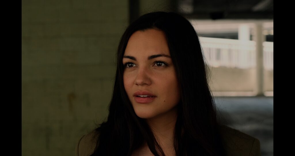
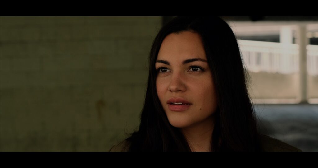
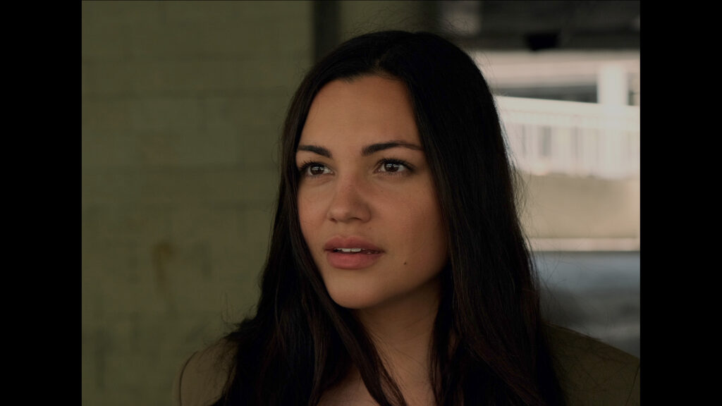
Here’s a sample of one shot from the film in each aspect ratio:
Golden Ratio
Widescreen
4:3 Academy
Hopefully this was helpful for those of you struggling to find the right look for your film.
Sometimes you have it locked in from the get-go. Other times you need to experiment in a roundabout kind of way, like I did.
How you get there doesn’t really matter.
The only thing that counts is the final product, and ensuring choice in format aligns with your greater vision.
For exclusive filmmaking articles every Sunday, sign up for my newsletter here!


No Comments