The 2:1 aspect ratio – known by some as Univisium – has gained a tremendous amount of popularity in recent years. So much that it may now be the fastest growing format in modern cinema.
I’ve written extensively about other aspect ratios in the past, but until today have yet to cover the highly sought after 2:1 format.
While films have technically been exhibited in 2:1 for over 70 years, the format remained relatively obscure until it exploded in popularity in recent years. Not only as an exhibition format, but as a capture format too.
2:1 is used more today than ever before. Its dominance it felt on virtually every type of project – Feature films, streaming series, television content, and even commercials are using it.
Let’s unpack a bit of history behind 2:1, and explore why it’s become so popular today.
History Of The 2:1 Aspect Ratio
The 2:1 aspect ratio dates back to 1953, when RKO first introduced the “Superscope” format. At the time, Hollywood was moving away from 4:3 as the de-facto format for cinematography. They wanted to differentiate theatrical movies from the home viewing experience. New widescreen formats emerged as a result.
RKO Superscope was one of these formats, having an aspect ratio of exactly 2.00:1.
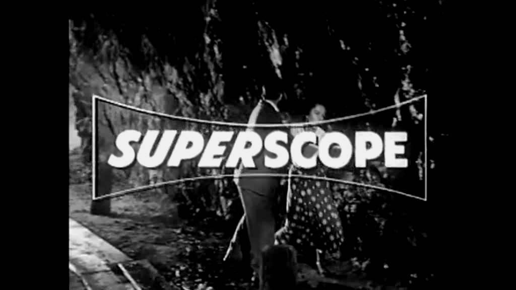
It served as a cheaper alternative to other widescreen options of the day – Like Cinemascope (2.39:1), which required more specialized anamorphic lensing and projection.
Ultimately though, Superscoope was only used on a handful of films in the 1950s – almost all of which were produced by RKO. Nearly all widescreen films from the 1960s onward were shot in either 1.85:1 or 2.39:1.
The 2:1 aspect ratio effectively vanished into obscurity. At least for a few decades…
Vittorio Storaro
In 1998, the 2:1 aspect ratio re-emerged for the first time since the early 1960s. And it was all thanks to cinematographer Vittorio Storaro, known for films like Last Tango In Paris, Apocalypse Now, The Last Emperor, and countless others.
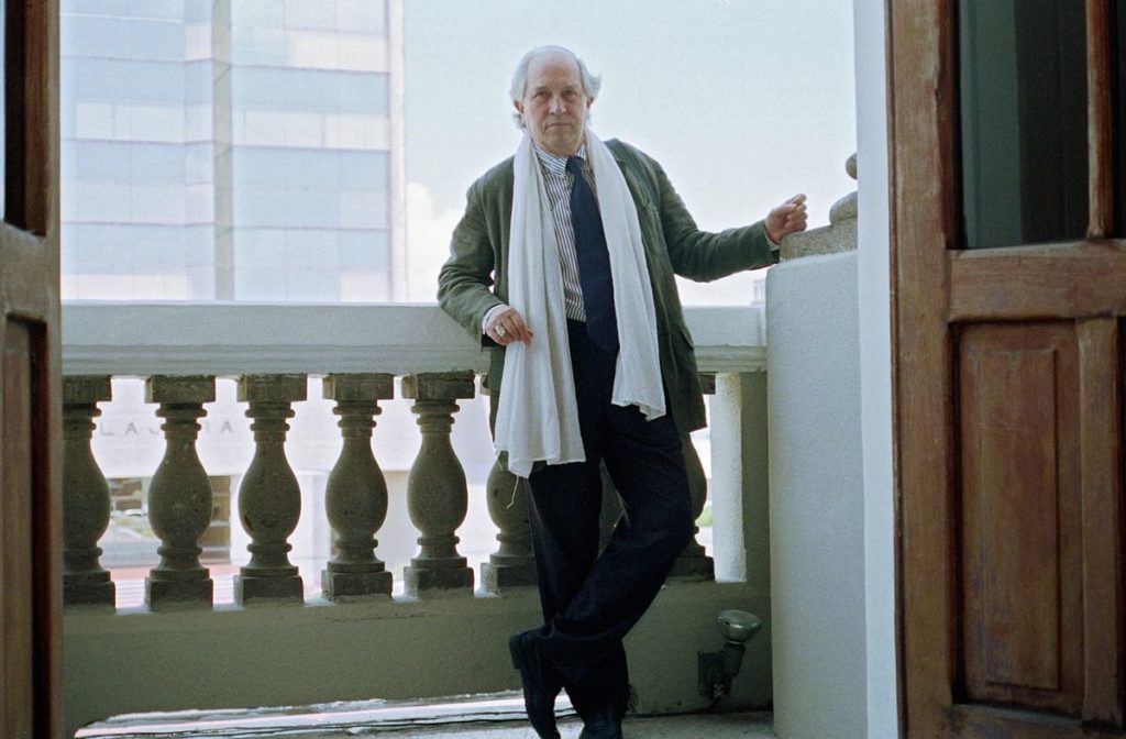
Storaro recognized that there was about to be a massive shift in film exhibition. Most movies were being watched at home on a television, not in the theater. And in the home television market, standards were changing with 16:9 HDTV’s on the horizon.
Storaro proposed that all films should be shot in an aspect ratio that was effectively a compromise. One that could look as good on a home TV as it would in the cinemas.
His answer was 2:1 Univisium.
Here’s how he explained it in his original proposal:
“Recently, any movie – no matter how big or small, successful or not – will, after a very short life on the big screen, have a much longer life on an electronic screen. Today the answer print is made for both of these two different media. …Having these two different media, with essentially two different aspect ratios, each of us (directors, production designers, cinematographers, camera Operators, etc.) shares the nightmare of compromising the composition of the Image. Looking through a viewfinder, a camera, or a monitor, we are always faced with at least two images of the same subject.”
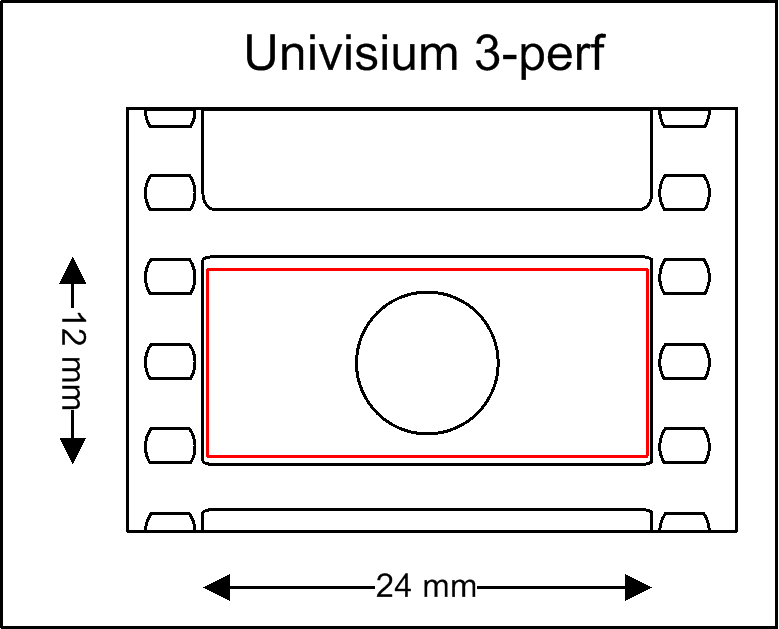
While Vittorio Storaro was clear with his vision, few other filmmakers ever adopted Univisium as a capture or exhibition format.
Storaro himself shot almost every one of his films from 1998 onward in the 2:1 Univisium format. But despite his push, it was still not yet adopted on any major scale.
2:1 & The Aspect Ratio Renaissance
As history will show, Vittorio Storaro was way ahead of his time.
For years, few (if any) filmmakers even considered shooting 2:1. It was either 1.85:1 or 2.39:1 for cinema, and 1.78:1 for HDTV. That was it.
But then came streaming services. And iPhones. And social media. And a thousand new methods of both capture and delivery, which completely dismantled any notion of standard aspect ratios. By the mid 2010s, aspect ratios became an overt creative choice.
We started to see more films framed in 1.33:1 or even 1.66:1, along with other experimental choices – like using a completely square 1:1 aspect ratio.
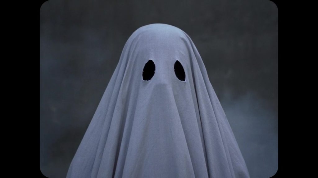
Despite the rising popularity of many of these unconventional formats, none were adopted to the same extent as 2:1. Not even close.
Today, the 2:1 aspect ratio is nearly as popular as 1.85:1. On streaming, it may well have eclipsed it. If there is such thing as a new standard in this era, 2:1 might be it.
Why exactly did this happen though?
There are many factors, but the biggest of them surely has to be the rise of Netflix.
Netflix’s Role In 2:1 Cinematography
Netflix is known for their rigid technical standards, including their list of approved cinema cameras.
We can certainly argue the validity of these standards, which frustrate many filmmakers. But there is no denying that the Netflix “rules” are creating a new aesthetic. It’s a byproduct of their ability to mass produce content using a set of strict visual guidelines.
Netflix does not restrict filmmakers from using widescreen aspect ratios (like 2.39:1). However, they do seem to discourage it with statements like this in their technical guides:
“Aspect ratios greater than 2.00:1 must be evaluated and discussed with Netflix for approval.”
Note that it is precisely the 2:1 aspect ratio that is Netflix’s limit for widescreen, without having to jump through additional hoops.
Perhaps this is one reason why so many Netflix productions – from Stranger Things to House of Cards are shot in 2:1. Logically, it could be looked at as a compromise between the filmmakers and the studio (Netflix).
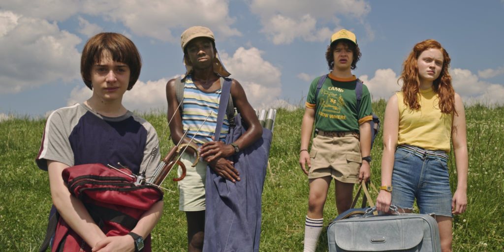
2:1 is right in between 16:9 HDTV and 2.39:1 scope.
It feels relatively wide to the viewer (serving the filmmaker’s goals), but still fills up enough of the frame to make for a substantial home-viewing experience (serving Netflix’s goals).
For this reason and perhaps others, it seems to be the middle ground that many productions have settled on. As a result, 2:1 has become the near-default aspect ratio of Netflix original productions.
Personally, as soon as I see a trailer for a film framed in 2:1, I almost instantly know I’ll find it on Netflix.
2:1 Aspect Ratio Outside Of Netflix
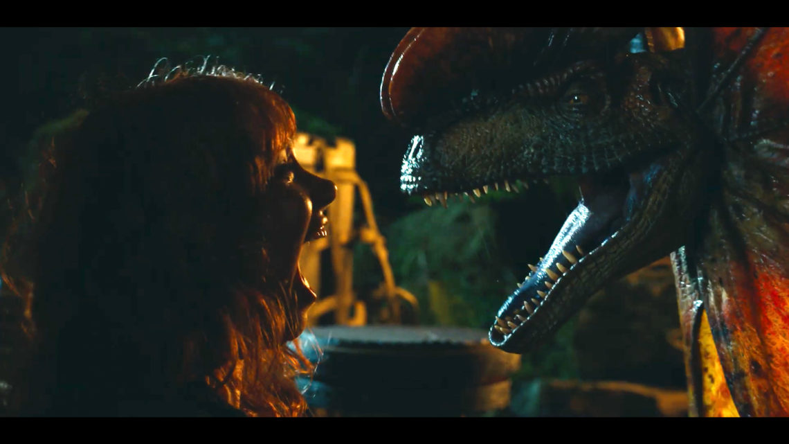
Netflix certainly has played a massive role in popularizing 2:1 as a capture and exhibition format. But today, it’s being used just about everywhere – from theatrical feature films (like Jurassic World Dominion) to broadcast commercials, and everything in between.
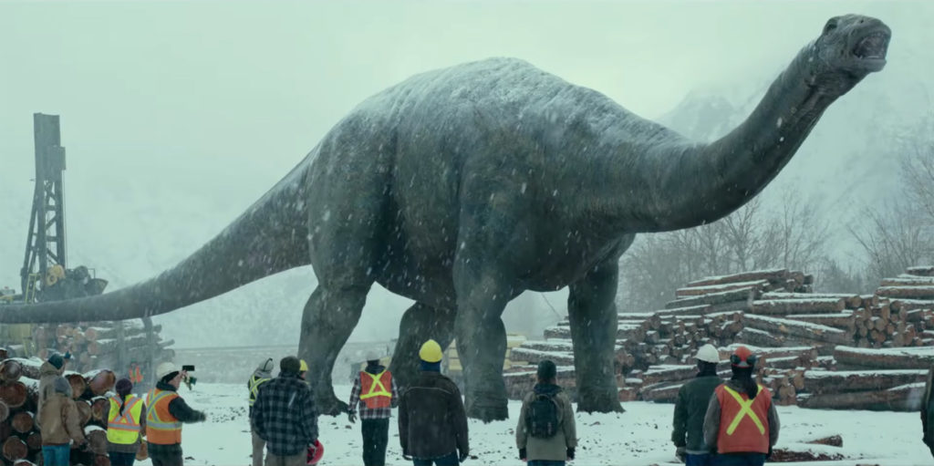
We’ve become so accustomed to viewing 2:1 content (thanks to Netflix’s dominance), that the look has become ubiquitous. It’s entered contemporary cinematic language, in a totally organic way.
What was likely a technical choice made by executives at Netflix to optimize for TV exhibition, has evolved into a stylistic aesthetic that is now sought after on every level of the industry.
And there’s no putting the cat back in the bag. I can only imagine the use of 2:1 inside and outside of Netflix will continue to skyrocket in years to come.
Final Thoughts
With 2:1 now unofficially accepted as a modern standard, we have yet another creative tool at our disposal. This really can only be seen as a good thing.
But whether or not you choose 2:1 for your project is of course entirely subjective. Personally, I don’t find myself particularly drawn to it from a purely creative perspective.
1.85:1 has such a traditional motion picture look, and in most cases I would choose it over 2:1. It’s not quite as wide, but it’s so classic – which I love. If I really want to go widescreen, I’ll typically opt for a 2.39:1 aspect ratio, which is much more dramatic.
I am also a big fan of shooting in 1.33:1 and 1.66:1. They are both so distinct, and can add a ton of character to the right project.
2:1 is still a fantastic option though, for many films and series. I might be more of a traditionalist myself, but it’s wonderful for those seeking a contemporary look.
And if there is such thing as the aspect ratio of the moment, it’s undeniably 2:1.
What are your thoughts on the 2:1 aspect ratio? Leave a comment below!
For more exclusive content like this, click here to sign up for my newsletter.
For exclusive filmmaking articles every Sunday, sign up for my newsletter here!


15 Comments
Brian Legrady
atWe make anamorphic lenses both 1.3X and 2X. Cameramen often ask me if they can shoot 2:1 with them, and until I read your article, I was perplexed by the notion of the existence of this format. (although I knew about Netflix’s tech restraints).
Now I am better informed.
Our 2X lenses deliver 2.39 with 4X3 sensors, as well as the 1.3X lenses with 16:9 Sensors. I tell cameramen that they need to crop eve so slightly on the sides for the 2:1 ratio… frame lines to be customized in the camera settings. Is this accurate? Also, a quick aside. I found in my film collection one of the first films exhibited in 2:1. SON OF SINBAD in Superscope. Including a few frame grabs here. If possible or allowed. looks like I can’t include images.
Richard Ward
atI was wondering about this issue and found your article in an internet search. It is really interesting, and I appreciate the information.
I am still a little confused about the “why” though. Why are they using 2:1 for limited-run series that are not intended for theaters (unless someone is still following the old practice of cobbling episodes together for “theatrical feature” release in other parts of the world)? I love widescreen, but it seems that something that is destined to play out its life on a 16:9 screen should be shot in such a way that it makes full use of every pixel.
Thane Armbruster
atI’m with you in that I don’t like seeing wasted space. I’m also not sold on the idea that it’s a purely creative decision. Instead I suspect it has to do with the fact that solid black spaces have a very high compressibility, creating much more bitrate/bandwidth headroom for the rest of the image to have a higher effective quality at any given resolution. This creates a more ‘cinematic feel’ perhaps like the inverse of the soap opera effect (Though personally I like interpolation technology).
Christopher Frances
atI saw Jurassic World Dominion at Cineworld Cinemas in the U.K. and was greatly disappointed that it was shown on a postage stamp 4 by 3 screen.No Wide-screen, however I remember watching MIDSOMMA a few years ago which was filmed in,200.1 which had a Wide-screen image how come?
Ben Cunis
atInteresting to note: the two most common screen ratios for mobile phones in 2021 (according to the internet) were 1.8:1 and 2.16:1 – for an average of about 2:1.
Noam Kroll
atThat is fascinating. Thanks for sharing this!
Rodrigo Chequer
atGreat article, I am a cinephile and i can say that I like the ratios from Widescreen Flat 1.85 to Scope 2.35/2.39. (I consider the 1.78 of HDTVs to be good and the minimum acceptable for me is the European Flat, of 1.66), I’m currently in love with the 2:1 (Univisium), as the balance it manages to maintain between width and height is incredible, which makes it the most proportional format of all.
However, anything below 1.66 (like 1.33, 1.37 and 1.43) I don’t find very pleasant, as the image starts to look a bit “square” and cramped, with a very limited view of the environment, making it seem like the narrative unfolds inside a “tight box”, which I no longer like nowadays, after becoming familiar with Widescreen formats. On the other hand, excessively wide formats, like 2.76 (Ultra Panavision 70), I don’t think are good either, because then the problem becomes exactly the opposite, where despite the gigantic ambient panorama, you start to have, at the same time, a very visible sacrifice in frame height, which is a little thin, making close-ups and central elements of the screen a little reduced. If the idea is to have something very broad and epic, I think Scope (2.35/2.39) is the perfect choice.
Despite this, I like many classic films and I always try to watch each film in its original ratio, respecting the native format of the work, even if it is not one of my favorites (I think it is disrespectful to the work to stretch its image or cropping it). I watch anything, I just have my favorite ratios and those that I don’t like very much and that’s my opinion. Thanks for your attention. ☺👍
DARCY GLADWIN
atdigging this, nice post ! i’m going to go 2:1 just because i like the word Universium 🙂 … cool to know Storraro is already there ! 🙂 http://www.predatorfilms.xyz
Noam Kroll
atHaha, I love that. Thanks for the note, Darcy.
Tré W
atI love the 2:1 ratio. I hope to shoot a romance film I plan to create in that ratio because it has the intimacy of 1.85:1 but the width of 2.39:1 for a few landscape shots I have in mind. Also one of the films inspirations If Beale Street Could Talk used that ratio beautifully.
Noam Kroll
atVery cool! Hope to see it when you’re done.
Thomas Hill
atCrazy that you posted this today. Yesterday, when putting the final touches on my $3-4K movie that I had been editing in 16:9, I was surprised to notice that some scenes had thin unexplained letterboxing. I guess I had been so focused on the colors since moving it into Resolve that I hadn’t noticed it before. It could only have come from the move and there’s no rhyme or reason as one shot within a scene that was rendered out all together has no letterbox while the rest of the shots in the scene do. Anyway, the simplest solution was to use an overlay in Resolve. And that was how I learned that 2:1 was even an official thing. It and 1.85 both cover the inadvertent come and go letterboxing with only a couple shots needing to be adjusted. Now, I know that it exists AND its history. Thanks!
Noam Kroll
atAbsolutely! So glad it was helpful, and thanks for the note.
Soren James
atCan’t wait to see the “iconic 2:1 movies” of the future! Most 2:1 films to me RN look like compromise, rather than a distinct identity: either scope with the sides chopped off, or squished 1:85. Which is weird because intellectually you can actually make a better case for 2:1 as the “ultimate aspect ratio” than you can for any other ratio! It’s 2-to-1. Humans have 2 eyes – 1 head. Twice as wide as it is high. It’s the most easily divisible, most easily translatable to strangers. It’s the aspect ratio Da Vinci used when he painted the Last Supper!
So obviously, there’s a distinct compositional school for 2:1 – just waiting to be explored in cinema.
It would be so much easier if I could easily distinguish its compositional advantages over the other 3 majors. There’s anamorphic ratios (and their ilk, so like 2:20-2:76) there’s academy ratios (basically 1:1-1:5) and finally widescreen (the 16×9 range – 1.66-1:90) . Or in layman’s terms: square, rectangle + panorama. Each of those is basically its own entire STYLE OF COMPOSITION. What is the 2:1 style of composition, beyond the compromise it offers? What are your thoughts on that part of it? A fascinating subject! What are some of your favorite 2:1’s?
Funny: I’ve noticed too – the most iconic uses of 2:1 so far seem to be framing more anamorphic-y – like Midsommar, or Ozark, or House of Cards – but then confidently open up top + bottom w/ extra negative space. Almost like how in Lawrence of Arabia or 2001, the choice of 2:20:1 feels extra special because the compositions are still framed with width and panorama of 2:40 in mind, but the extra headroom adds that little oomph.
Noam Kroll
atFascinating observations – thank you so much again for sharing this. Agree 100% with you, especially about the compromise of 2:1.