One of the greatest stylistic tools that filmmakers have at their disposal is undoubtably the aspect ratio. But with so many available to you, it’s critical to understand how and when to use each available format.
Up until somewhat recently, aspect ratios were fairly standardized. For decades TV was broadcast exclusively in 1.33:1 (later becoming 1.77:1 with HDTV), and the vast majority of feature films were shot in either 1.85:1 or 2.39:1.
Recently though, many filmmakers (myself included) have been getting more experimental with aspect ratio choice. We’ve seen older formats like 1.66:1 and 2.76:1 re-emerge, only now they are being used in different ways.
Not only are today’s filmmakers more open-minded in aspect ratio choice, but audiences are too. Unconventional formats haven’t stopped TV shows like Homecoming or movies like The Lighthouse from finding incredible success, even while breaking away from traditional norms. If anything, their unique visual styles have only bolstered their appeal.
If you’ve landed on this article, chances are you are a filmmaker trying to determine which format/aspect ratio would be best for your next film. So that’s what I will help you do.
Below, I’ve broken down a few of the most popular aspect ratios, along with a brief summary of where they may be best suited. Keep in mind these are just my opinions, and it’s ultimately up to you to determine which format is right for your project.
With that in mind, let’s dive in –
1.33:1 (4:3) – Academy Ratio / Classic Television
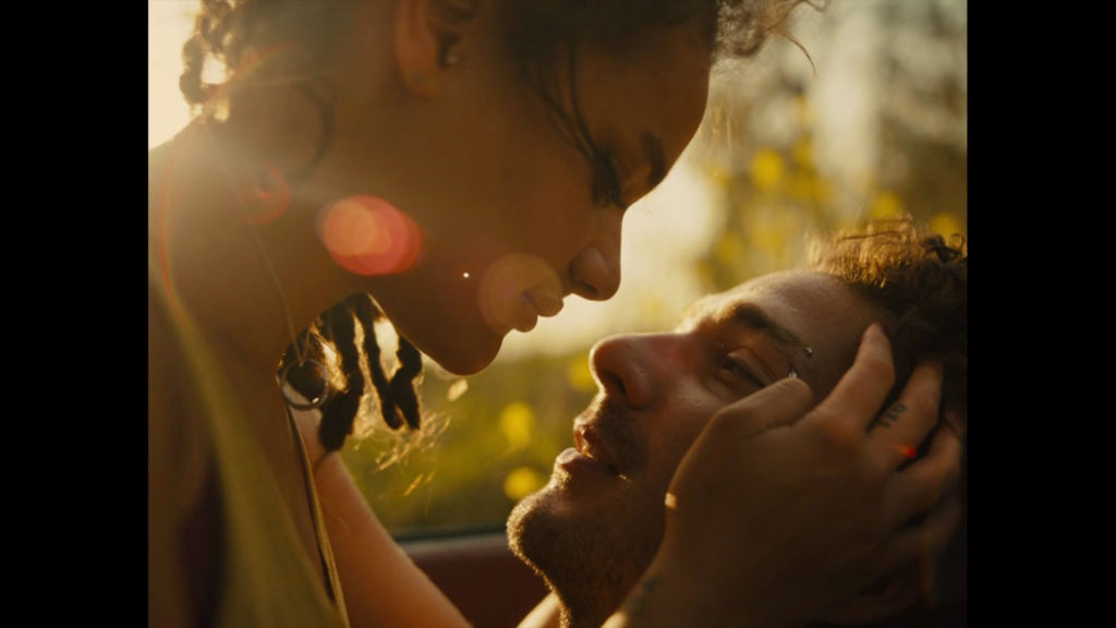
The original academy ratio is still going strong today. In fact, it’s having a resurgence like most of us could have never imagined.
1.33:1 was the standard format for early motion pictures, and remained the dominant television format until roughly twenty years ago. Since then, it’s faded from the mainstream, but more recently has resurfaced again, predominantly thanks to its nostalgic appeal.
For period pieces that take place in the 1.33:1 era (like the recent film Mid 90s), this format may be a no-brainer. But it can work just as well in contemporary-set films that are seeking a bold/art-house aesthetic.
1.33:1 is arguably the most “noticeable” aspect ratio you could use, as it’s the furthest away from standard HDTV (1.77:1) – which is the format most modern audiences are accustomed to.
Wider aspect ratios have their distinct benefits too, but there is something about the near-square format of 1.33:1 that can’t help but draw attention to itself… In a good way. It’s not right for everything of course, but for the right project it can make quite the statement.
It tends to work quite well with genre films (horror and thriller specifically), because the square frame confines the viewing experience, which can create a sense of tension and claustrophobia. But I’ve also seen it used to great success in dramas and other genres too.
A side benefit of shooting in 1.33:1 is that the format is already optimized for online distribution. Wider aspect ratio projects don’t play as well online – particularly on mobile devices – whereas 1.33:1 is a near perfect fit.
1.33:1 Examples: American Honey, The Lighthouse, First Reformed, Son of Saul.
1.66:1 – European Standard
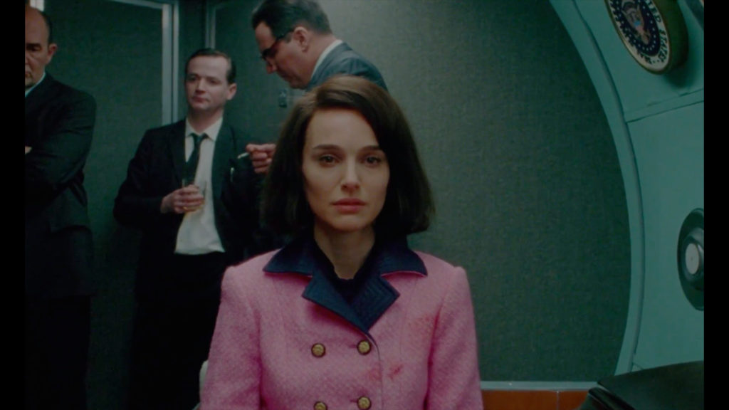
This is one of my personal favorite aspect ratios, and I plan to shoot my next feature film using it.
1.66:1 originated in Europe as a standard aspect ratio for theatrical projection, but it also has roots in Super 16mm cinematography. Unlike regular 16mm film that has a 1.33:1 aspect ratio, Super 16mm film has a native 1.66:1 aspect ratio.
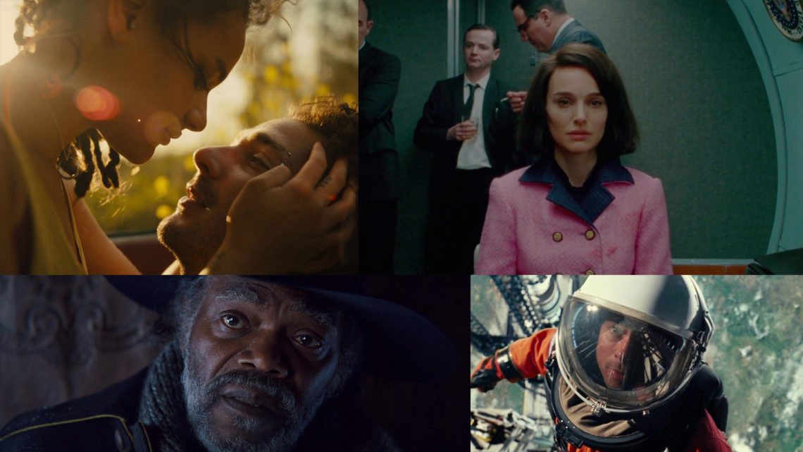
Given its extensive history in both European and indie cinema, the 1.66:1 ratio has been used on countless iconic films, ranging from classics like Dr. No and A Clockwork Orange to modern gems like Jackie and The Witch. Any project with thematic roots in European cinema or American art-house would be an obvious fit for 1.66:1.
This aspect ratio is also highly versatile. The shape of the frame is ideal for shooting closeups, making it suitable for dramas, comedies, or really any film emphasizing performance. At the same time, it’s just wide enough to capture landscapes/establishing shots effectively, which is something that is often a challenge with its sister format, 1.33:1.
From a strictly technical level, 1.66:1 could be quite convenient to work with in today’s day and age – Especially since many projects are now required to generate multiple deliverables for various mediums.
If you’ve shot/edited your project in 1.66:1, you could easily crop to 1:1 (square) for social media deliverables, or to 1.77:1 for broadcast purposes. I wouldn’t ever suggest choosing a format for this reason alone, but it’s a nice added bonus.
More likely, you would choose to shoot in 1.66:1 if you’re looking for an artful/nostalgic aesthetic that isn’t quite as extreme as 1.33:1.
1.66:1 Examples: The Beguiled, Marriage Story, High Life, The Last Black Man In San Francisco.
1.77:1 (16:9) – Widescreen Television Standard
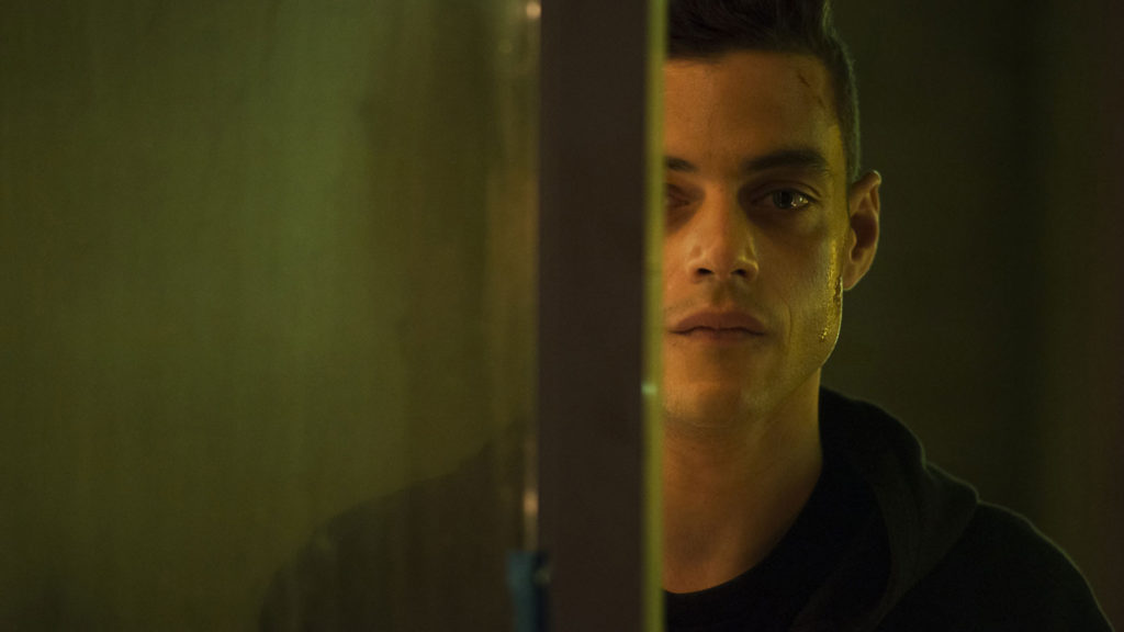
This aspect ratio is the most common format in existence today, as it is the standard for widescreen HDTV viewing. For that very reason, I advise against shooting 1.77:1 for almost all narrative film projects, and to strictly use it for TV/digital/broadcast projects.
Rooted entirely in digital television, very few feature films have ever been captured in this format, other than made-for-tv movies or documentary projects. This is an important consideration relating to the audience perception of your work.
While Joe or Jane Movie-goer might not understand the nuances of aspect ratios the same way you do, they still have a strong cinematic vernacular. They’ve been watching movies and TV for many years, and they can feel the difference between a TV show shot in 1.77:1 and a theatrical movie projected in 2.39:1.
So if you are making any sort of narrative film project – short, feature, or otherwise – I would recommend avoiding 1.77:1. Shooting a narrative film in 1.77:1 can inadvertently make it feel like it’s meant for TV (not the big screen), and that’s something you likely want to avoid.
At the same time, some projects are meant for the small screen. The vast majority of commercials and music videos are shot in 1.77:1, as they should be. The same goes for many documentary films and TV pilots. And of course any video project that will live entirely online (like wedding videos or corporate spots) are almost always best captured/mastered in 1.77:1.
As a general rule of thumb: Avoid 1.77:1 for most narrative films, but consider it a great option for documentary films, non-scripted projects, and other video-based material.
1.77:1 Examples: RGB, Skin, Mr. Robot, Mad Men.
1.85:1 – 35mm Motion Picture Film
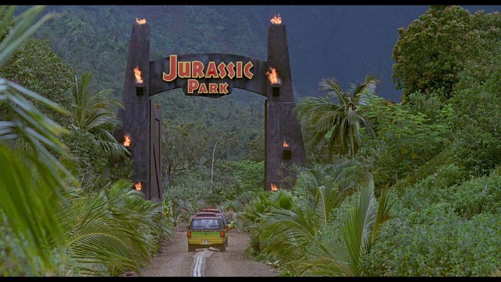
As you may know, 1.85:1 has long been a gold standard for Hollywood motion picture films.
Many of the most iconic movies of the past half-century have been shot in 1.85:1, including The Shining, Taxi Driver and Schindler’s List, just to name a few. Today the format is still as popular as ever, finding its way onto movies Joker and The Favourite, among countless others.
1.85:1 is very close to 1.77:1 (HD 16:9) in size, but is just slightly wider. From a creative perspective, there is barely any difference between 1.85:1 and 1.77:1… Both will give you almost an identical field of view and frame. That said, I still recommend narrative productions utilize the 1.85:1 aspect ratio over 1.77:1.
When modern audiences view something in 1.77:1, it subconsciously says “TV”. The slight letterbox and wider aspect of 1.85:1 is associated with cinema. However subtle the difference may be, it’s there and the audience can feel it.
It’s a minor distinction, but it matters. Not only to your eventual audience, but to other potential collaborators/partners along the way.
If you’re going to submit a feature film to a film festival/agent/buyer who is well versed in cinema, wouldn’t you want to present the film in the best format? One that’s standardized for motion pictures, not for HDTV? It may not make or break your production, but the little details add up.
Creatively speaking, an important consideration with 1.85:1 is that it doesn’t make a huge statement. The format commonplace – almost invisible – and does not distract the viewer in any way. The same couldn’t be said of most other aspect ratios.
Many directors, including Steven Spielberg, have embraced 1.85:1 on countless films, so those seeking to embrace the format are in good company. It’s subtle, tasteful and will get out of the way, placing the emphasis on your story and performances.
All that said, projects intended for TV or web (that are considering this aspect ratio) may be better served by 1.77:1 (16:9) for the reasons outlined in the previous section.
1.85:1 Examples: The Jungle Book, Jurassic Park, Hail Caesar, Manchester By The Sea.
2.39:1 – Widescreen 35mm Motion Picture Film (Anamorphic)
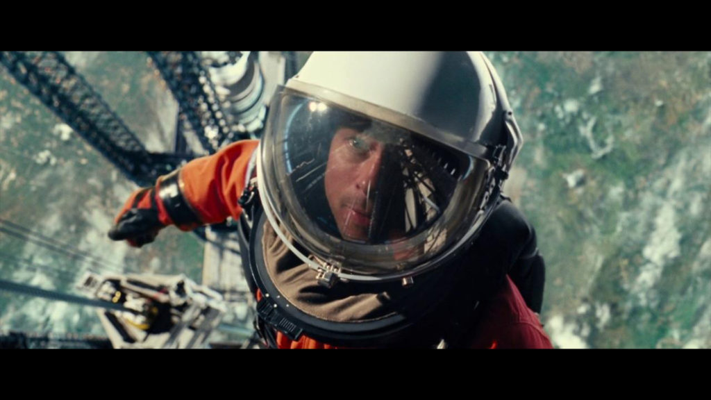
This is the format that most modern filmmakers associate with “cinema”, as its wide canvas opens up countless stylistic framing opportunities.
Decades ago when the 2.39:1 aspect ratio first emerged, it was achieved by using anamorphic lenses on standard 35mm film. But as it became more and more popular, filmmakers began to crop (or matte) their images in post to achieve the widescreen effect, even if they shot in another format.
Today, feature films, documentaries, shorts and music videos are often cropped in post to have the appearance of 2.39:1. This is common on every level of the industry, from amateur films shot on iPhone to professional blockbusters shot on Arri Alexa.
More than any other aspect ratio on this list, 2.39:1 instantly screams CINEMA. It’s the format audiences are accustomed to seeing the highest budget blockbuster films in, which is naturally why so many filmmakers gravitate to it.
There’s no better format to show off a dramatic landscape or action sequence than 2.39:1. It’s also unmatched in its ability to create and emphasize negative space in the frame, which is far more challenging in other aspect ratios.
While 2.39:1 might be the obvious choice for narrative films seeking a high-end/blockbuster aesthetic, it can be equally valuable on other project types too.
I’ve seen 2.39:1 put to use beautifully on everything from car commercials to wedding videos, adding a cinematic flare that differentiates the final cut from similar projects. Some of the best uses of 2.39:1 are the unexpected ones, so keep an open mind to this format for any project that needs a dramatic touch.
With that in mind, 2.39:1 is also quite over-used these days, and not every project needs to ooze the big screen look. Resist the temptation to use 2.39:1 for everything just because it’s easy, and consider whether another format would better suit your creative needs and distribution channels.
2.39:1 Examples: Ad Astra, Avengers: Endgame, Black Panther, A Star Is Born.
2.76:1 – Ultra Widescreen / 70mm Motion Picture Film (Anamorphic)
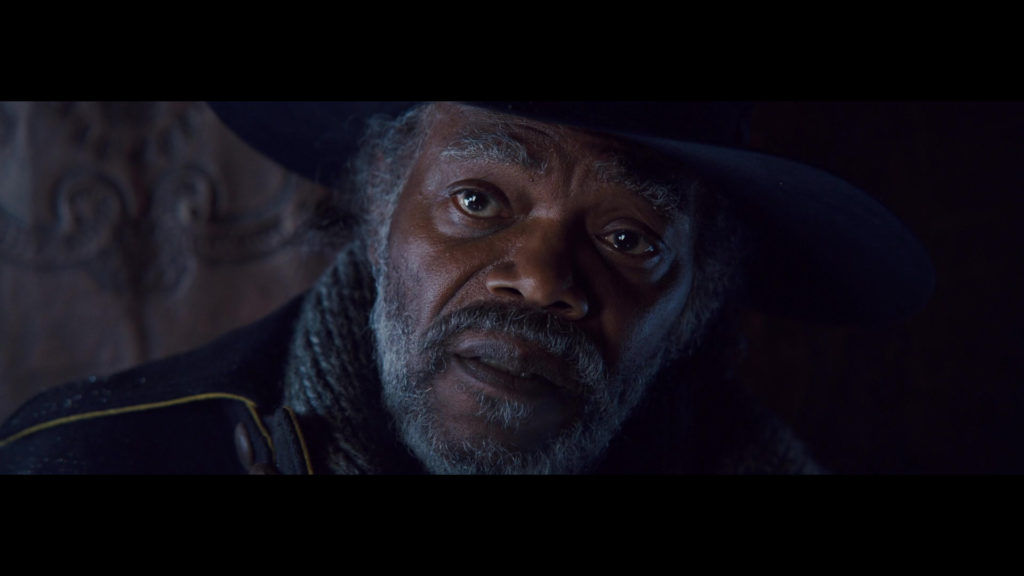
This is the final, and probably most obscure aspect ratio on this list, but it certainly deserves its place.
2.76:1 first really hit the scene in 1957 when Panavision paired anamorphic lenses with 65mm film stock to create a whole new type of widescreen image. The format was only ever used on a handful of films (mostly in the 1960s), and was ultimately very short lived.
Before it fell out of popularity, there were a number of iconic films that used the 2.76:1 aspect ratio, like Ben-Hur and It’s a Mad, Mad, Mad, Mad World. So despite its limited use in cinema, the legacy of 2.76:1 is quite strong, and still lives on today.
Recently, Quentin Tarantino embraced the format on his film The Hateful Eight, which was shot entirely on 65mm film using the original Panavision anamorphic lenses. This was an example of the format put to incredible use, as it complimented the movie’s narrative scope beautifully.
Because it creates such a dramatically wide frame, many filmmakers are naturally drawn to 2.76:1. That said, it is often misused on projects that would likely benefit from using another aspect ratio entirely.
In my opinion, 2.76:1 is a format that should only be considered when shooting with anamorphic glass. Call me traditional, but since this aspect ratio was only ever achieved (historically) using special anamorphic lenses, it just never looks right when faked with spherical glass/cropping.
If anything, cropping your image to 2.76:1 just for the fun of it can cheapen the look of your project, and make it feel gimmicky. There’s a big difference between shooting 2.76:1 natively using anamorphic glass on a 65mm motion picture film camera, and letterboxing your iPhone footage to 2.76:1 in FCP X.
That’s not to say there isn’t a time and place for 2.76:1, you just need to tread carefully. Narrative film projects (especially those in the western/epic/action genres) can often benefit from the visual opportunities 2.76:1 provides. But those projects can only maximize the 2.76:1 ratio by shooting on a larger format camera, ideally with anamorphic lenses.
In my opinion, narrative features (with an aim for theatrical distribution) are the best candidates from 2.76:1. Anything that will ever be distributed online or used for broadcast purposes would almost surely be better off using another format. The ultra-widescreen aesthetic is beautiful in a theatrical setting, but not so conducive to today’s smaller screens.
2.76:1 Examples: The Hateful Eight, Ben-Hur, It’s a Mad, Mad, Mad, Mad World, The Greatest Story Ever Told.
That’s about it for now!
What are your thoughts? Leave a comment below and share your favorite aspect ratio.
For more exclusive articles like this every Sunday, sign up for my newsletter here.
For exclusive filmmaking articles every Sunday, sign up for my newsletter here!


11 Comments
Rodrigo Chequer
atMy personal opinion:
– Of the ratios on this list, my favorites are 1.85 and 2.39. The first is because it best balances width and height, making it incredibly versatile (I also really like the “recent” 2:1, for the same reason);
the 2.39 for being perfect for anything more “epic” and based on panoramas of landscapes and/or grandiose scenes/worlds in general.
As for the others, 1.33 I think is very square and has almost no panorama, which limits it too much; 1.66, although much better than the one mentioned above, I still think it’s a little narrow (I don’t like tight frames) and 1.77 I think is suitable for TV programs; I think the 2.76 is too exaggerated, because although it is ultra wide, it sacrifices too much frame height. The 2.39 is the best “epic” ratio, as it is quite wide, but without sacrificing too much height scale.
This, however, is just my personal opinion, everyone has their preferences and of course, regardless of that, I understand and respect the director’s original vision for his project.☺
Rodrigo Chequer
atGreat article, I’m passionate about cinematography. Mr. Kroll, I would like to recommend that you add 2.00:1 to this list, it has been used quite frequently these days and is a ratio that has proven, in my opinion, to be very versatile.
Sheridan
atHi Noam. Respectfully, I completely disagree on your somewhat oversimplified take on 16:9 being an aspect ratio for ‘made for TV’ types of work.
Mr Robot does NOT look like a TV show and that made innovative and exciting use of the 16:9 frame. Want to convey negative space? Try doing that with 4:3 or 2:39.1. You couldn’t.
Shan
atFrom the creative side, what would happen if you make up your own aspect ratio? Would it not be playable anywhere or do online platforms squeeze it into the nearest fitting format? It used to be it wouldn’t play at all, but I don’t know the latest. Thanks!
Noam Kroll
atAnything is possible and fair game, really. You might just start a new trend 🙂
mohamed
atHi Noam, super great to read, what are your thoughts on the Vittorio Strorara 2:1 Univisum aspect ratio and how would you compare it to the close 1.85:1
best
Noam Kroll
atGreat question, Mohamed. I like 2:1 a lot, but since these days it is mostly associated with the RED camera/Netflix, it hasn’t been my preferred ratio.
Todd Dominey
atSo glad you posted this. I remember watching “Last Black…” and I couldn’t get over how amazing the aspect ratio looked. Can’t remember the last time I’d seen it used. There’s just something about the full vertical height and slimmer width that makes a 16:9 TV look much bigger. Love it!
Noam Kroll
atI agree! Thanks so much for the note, Todd.
Carlo
atGreat! I would just have added the 2:1 format (House of cards) which is in my opinion an interesting format today.
Noam Kroll
atI will aim to update the post and add it in. Thanks for the suggestion!