Using a non-standard aspect ratio is one of the most effective ways to subtly shift the tone of your film. In this post, I’ve highlighted some contemporary movies that benefitted from non-standard (often vintage) aspect ratio choices.
I’ve written a lot about alternative aspect ratios, including in this article about picking the right aspect for your movie.
But for those looking for even more inspiration, check out the list of films below. Each of which broke away from a conventional 1.85:1 / 2.39:1 format.
1:1 – Mommy
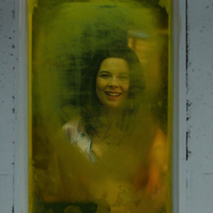
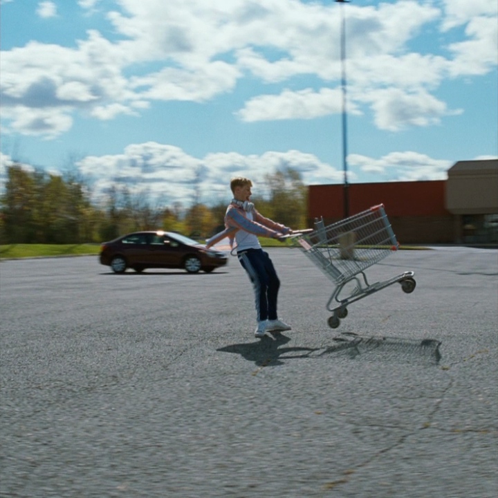
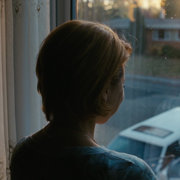
Very few films have ever been shot using a fully square aspect ratio. But the 2014 feature Mommy by Xavier Dolan and André Turpin is one rare exception to that rule.
The 1:1 ratio creates a constricted, simple, but highly focused frame with a touch of nostalgia. It tends to make the viewer feel like they are looking in on something, like a viewfinder from an old film camera.
With the 1.33:1 (or 4:3) aspect ratio becoming increasingly popular again, 1:1 differentiates itself as an even less common choice. I suspect we will see an uptick in 1:1 films in the coming years, just as we’ve seen with 4:3 and other less conventional formats.
1.19:1 – The Lighthouse
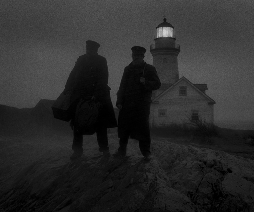
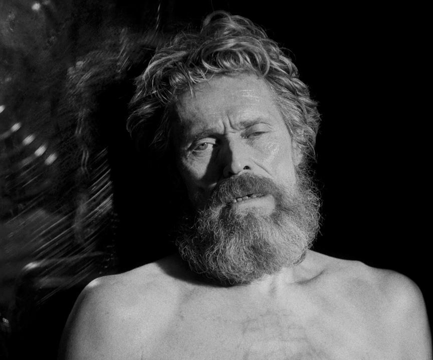
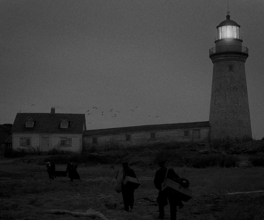
Another extremely rare aspect ratio is 1.91:1, which was most recently utilized on Robert Eggers’ film The Lighthouse.
This aspect ratio was predominantly in play between 1926 and 1932, as the industry transitioned to sound. To make room for an optical soundtrack on the film strip, the aspect ratio was cut from a native 1.33:1 to the more squared off 1.19:1.
Although in those days, many films were later masked to 1.375:1 and projected to the audience in that format.
As for The Lighthouse, the 1.19:1 aspect ratio was reportedly chosen to best capture the time period the film was set in (the 1890s). And to create the most powerful framing opportunities for faces, as well as the actual Lighthouse itself.
1.37:1 – Cold War
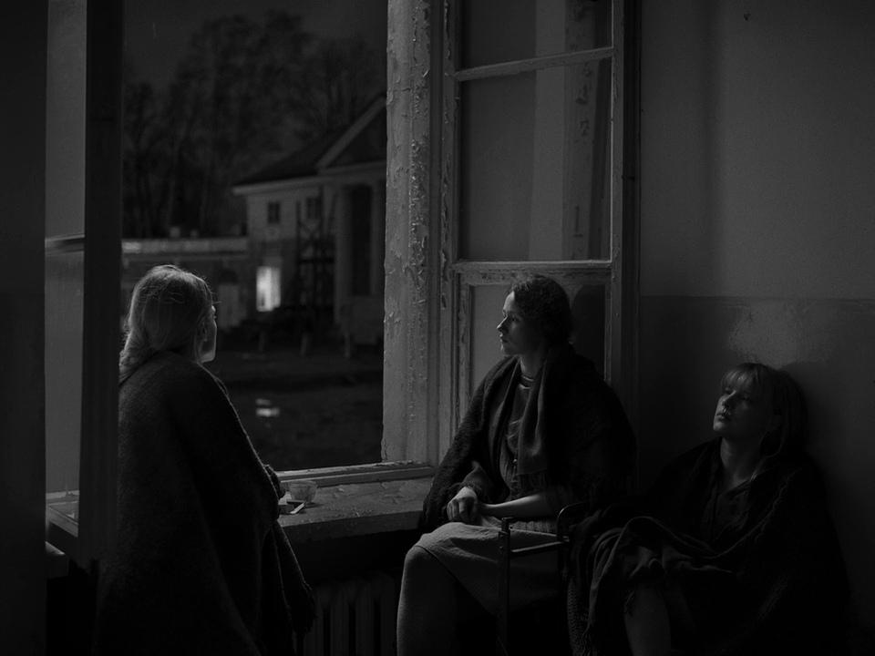
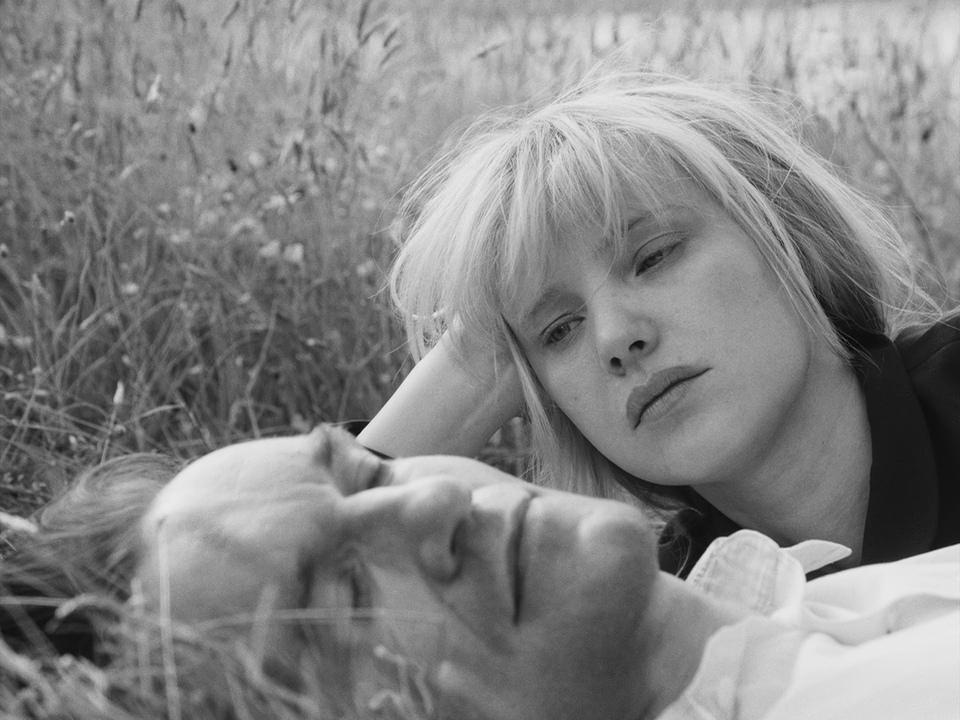
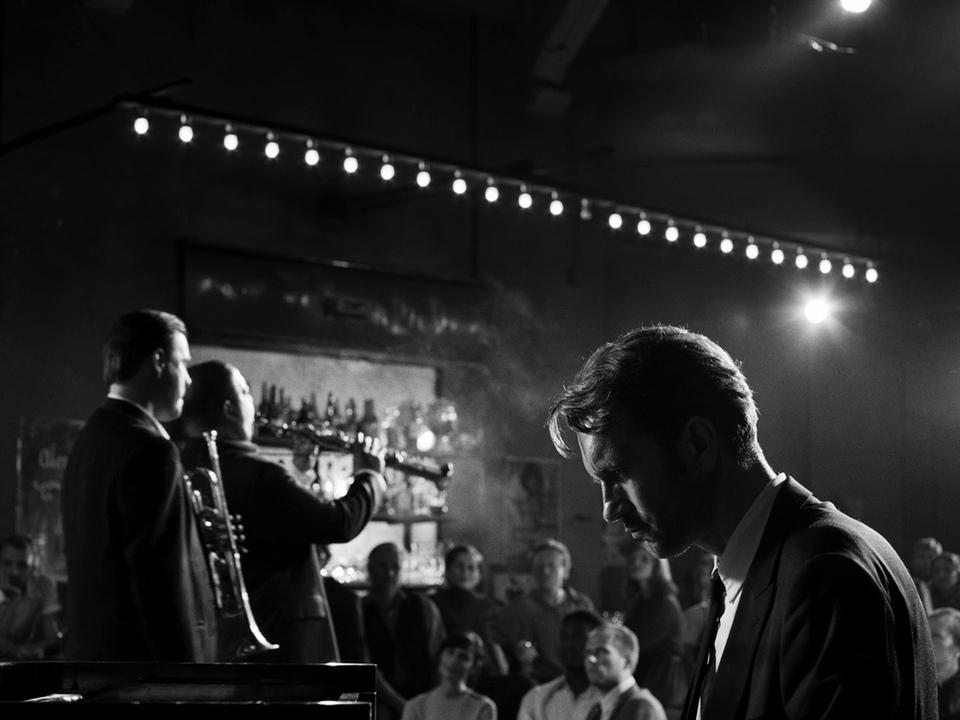
In the early 1930s, 1.37:1 become the Academy standard aspect ratio. This is why (as stated above) many films shot in 1.19:1 were ultimately reformatted to this standard.
Virtually every studio movie made between 1932 and 1952 was made using the 1.37:1 Academy standard. So it’s far from an obscure aspect when you consider the full scope of cinema history.
That said, until recent years it spent many decades sitting on the sidelines, going mostly unused. Paweł Pawlikowski’s Cold War is one of the few modern examples of 1.37:1 put to use on a contemporary feature film.
For Cold War, the unique 1.37:1 aspect ratio was chosen for a variety of reasons. DP Lukasz Zal said it offered the most framing choices, and “felt more like painting” when compared to more standard aspects. And given the time period it takes place in, 1.37:1 was a natural choice.
2.20:1 – Mank
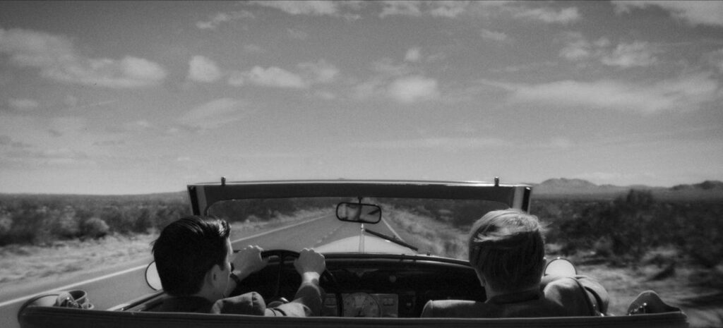
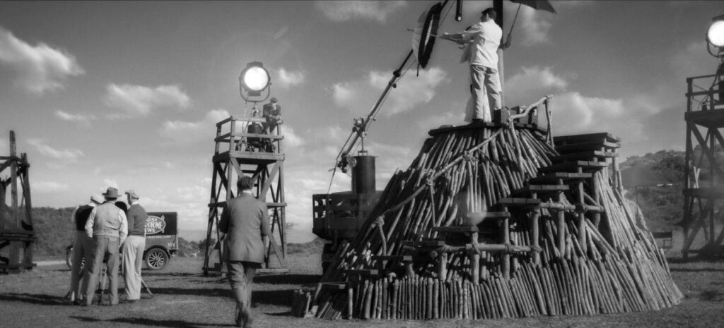
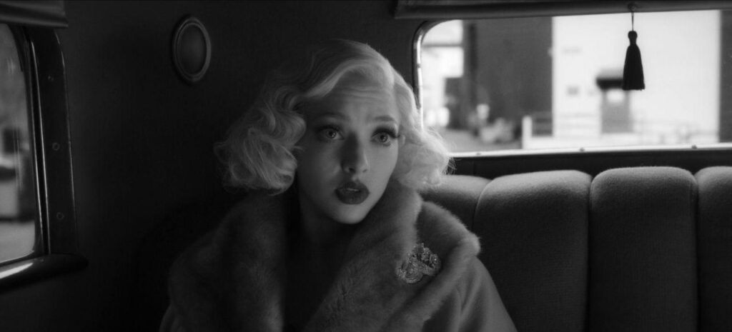
In the early 1950s, a new widescreen format emerged called Todd-AO. It was designed to capture a widescreen image on a single camera (rather than the multi camera Cinerama method). This was accomplished by filming on 65mm negatives which were contact printed to 70mm positives.
Ultimately the process resulted in a 2.20:1 aspect ratio. Close to today’s standard 2.39:1 aspect, but off just enough that you can feel it.
David Fincher’s Mank is among the only films in recent memory to make use of the format.
DP Erik Messerschmidt said the 2.20:1 ratio felt more intimate, and worked really well for two-shots and over the shoulder takes. And even though the format wasn’t technically accurate to the period the movie was shot in, it still felt aligned with the overall tone.
2.55:1 – La La Land
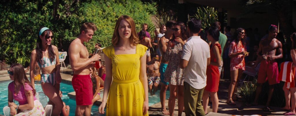
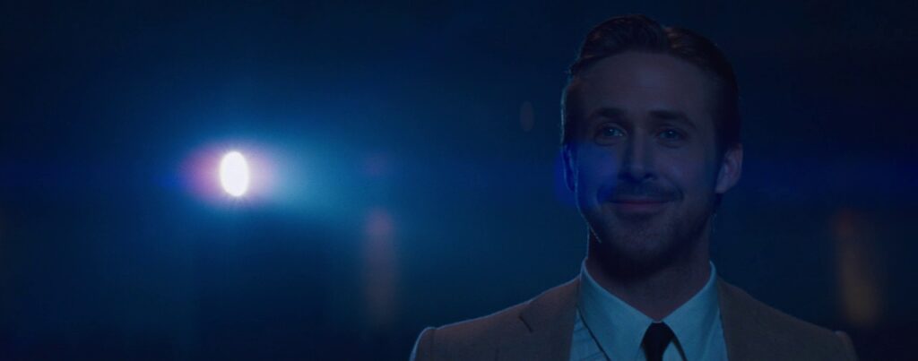
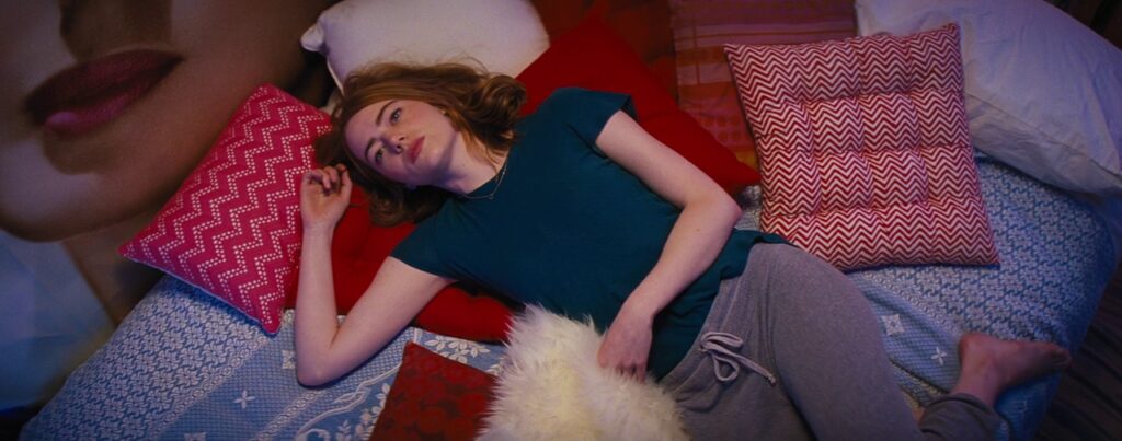
Today, when we think of Cinemascope we mostly associate it with the standard 2.39:1 widescreen aspect ratio. But for a period leading up to the early 1950s, Cinemascope actually offered a slightly wider look at 2.55:1.
Things only changed in 1954, when optical sound was added to the Cinemascope format, and in turn made it slightly taller.
Linus Sandgren (DP of La La Land) said that Damien Chazelle wanted to shoot the film with anamorphic lenses, as he liked the optical qualities. But that they ultimately chose 2.55:1 to really lean into the earliest days of anamorphic and pay homage. Drawing inspiration from films like A Star Is Born (1954).
2.76:1 – The Hateful Eight
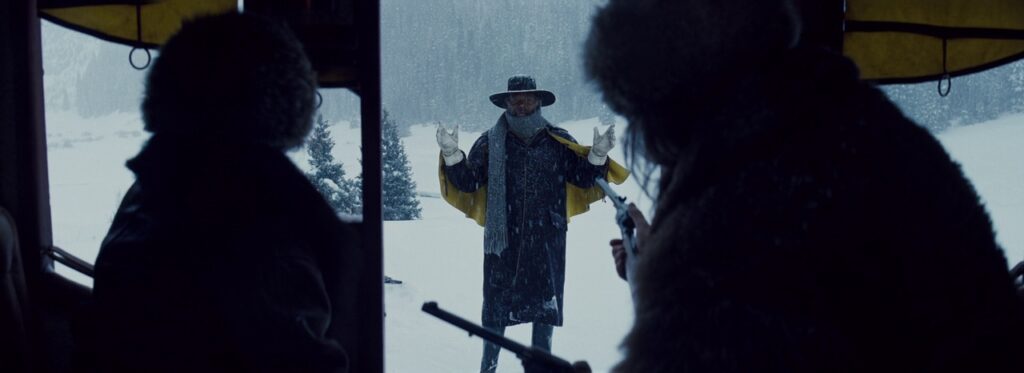
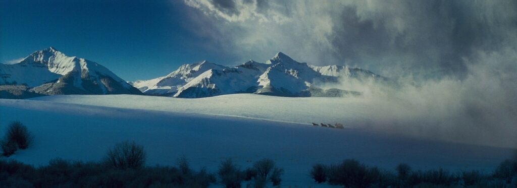
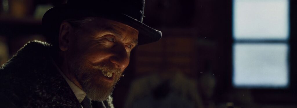
This extremely wide aspect ratio has only been used on a handful of films between 1957 and 1966. All captured on Ultra Panavision 70 (65mm film with 1.25 anamorphic squeeze). But recently it was brought back on Quentin Tarantino’s The Hateful Eight.
Tarantino has said he grew up loving the Ultra Panavision 70 format, as so many iconic movies (like Ben-Hur) made great use of it during its short-lived heyday.
DP Robert Richardson stated that on The Hateful Eight, it helped them not only capture beautiful vistas, but also the “landscape” of the human face. Offering powerful closeups with new possibilities for framing.
Wrapping Up
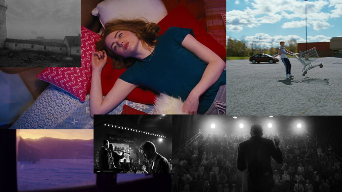
These are just a handful of examples of recent feature films that have benefited from unique aspect ratio choices.
There are countless others to draw inspiration from. I suggest you seek out some films in these (and other unconventional formats), and try to really get to know the nuances of each.
There are also many other less standard (but still popular) aspect ratios that I didn’t cover here. These include 1.33:1, 1.66:1, and 2.0:1, among others. While these aren’t as widely used as 1.85:1 or 2.39:1, they have had a resurgence in recent years and are certainly worth exploring too.
For more on choosing the right aspect ratio for your film, read my article here.
Which of these formats is most interesting to you? Leave a comment below!
For exclusive filmmaking articles every Sunday, sign up for my newsletter here!


No Comments